When it comes to design processes, every designer strives for perfection. Even in the riso printing process, adjustments are made to the printing positions, such as lowering the blue colour by a few millimetres and shifting the red colour to the left by a few millimetres, in order to achieve a better outcome. So this week, I was thinking about what would happen if I completely broke the printing rules of the Riso machine. If I bring in more such uncertain factors, such as others’ rejected works or previously discarded works, what differences would arise? Therefore, this week I attempted to break many of the rules of riso printing, such as having to wait until it dries before printing, and having to be at the precisely adjusted and perfect position…
Preparations before printing
In order to conduct the research more effectively, this week’s experiment will mainly focus on hacking. Therefore, before starting the printing this week, I chose to print only two colours: yellow and green. These two colours have unique textures. For example, the yellow has high brightness and strong transparency. Compared to other colours, yellow is more likely to be marginalised in white or light-colored backgrounds and relies more on the expression with other colours. However, green has a higher saturation and is a relatively strong cool colour, which has a certain degree of high coverage. To a certain extent, these two colours can reconstruct or cover the original visual centre and effect.
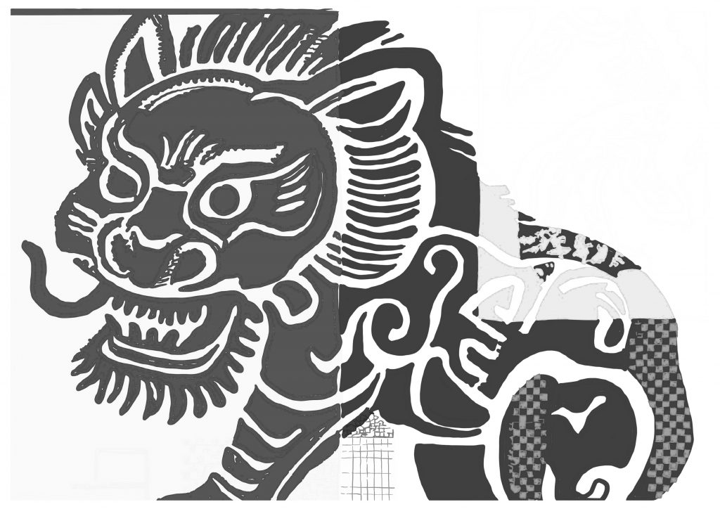
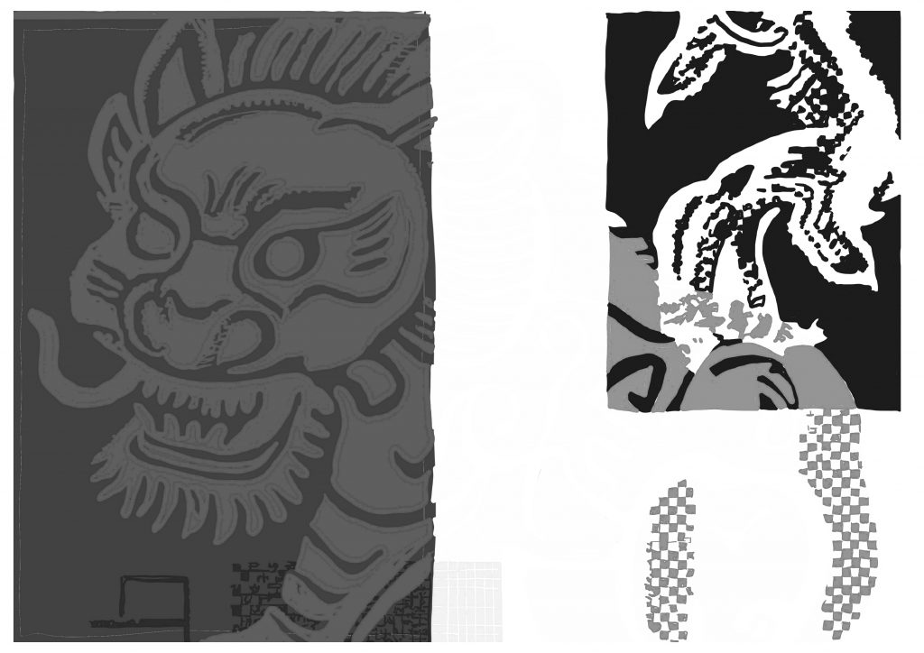
left is the green one; right is the yellow one
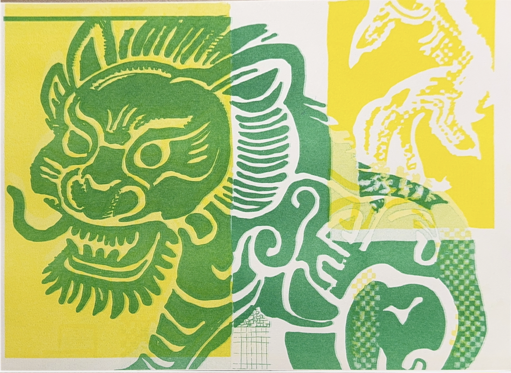
This is the colour and effect presented by the machine at the very beginning of its printing process.
So in the first group of experiments, I chose to prioritize iterating on the appearance of this sample. By using the mechanism of the riso machine adjusting its position as needed, I iterated to see what unexpected results the machine itself would produce. Therefore, during this iteration process, I abandoned the preheating of the machine and the process of constantly printing to change the position until the previous position completely disappeared.
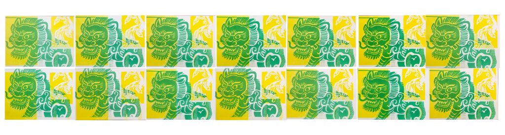
At this point, when the machine itself is changed for the green or yellow printing positions, the visual focus remains on the lion itself. The previous printing looks like the shadow of the lion and is superimposed on it.

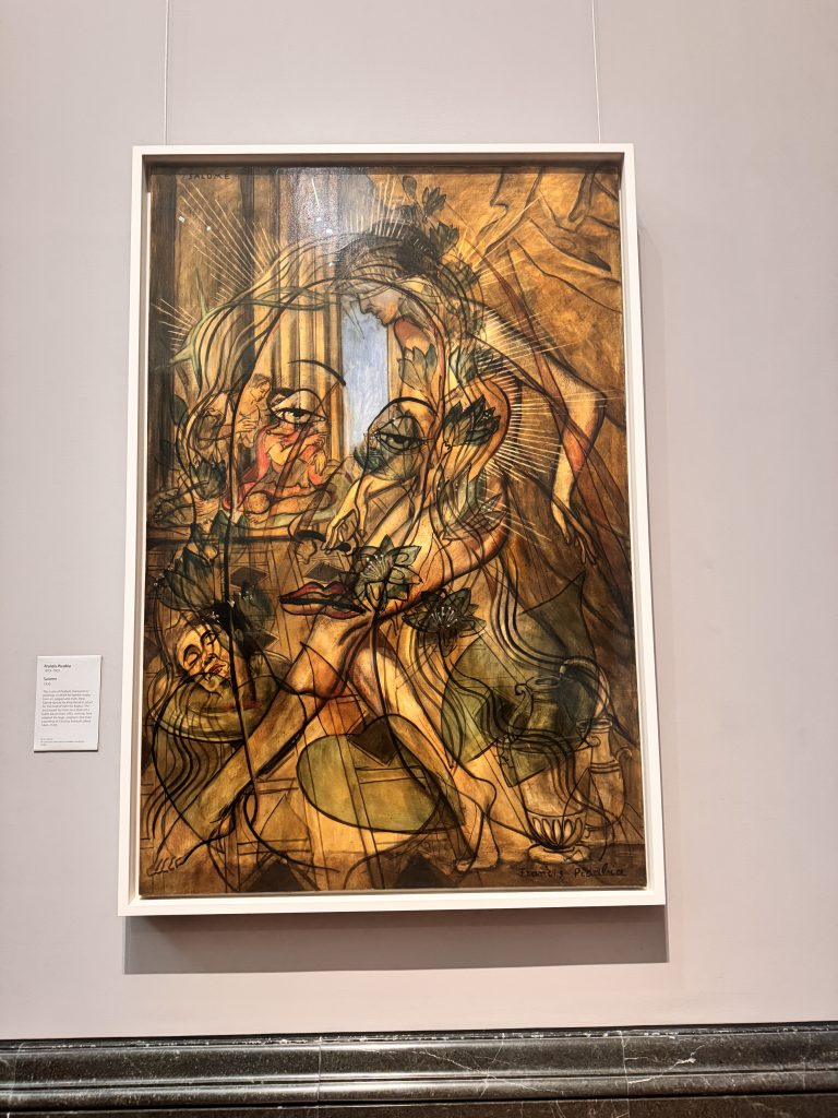
But I think this iteration is still not very interesting. So, on the weekend, I went to the art gallery and saw Francis Picabia’s “Salome”. He also creates a multi-dimensional space by using semi-transparent oil paints or pigments and making multiple layers of overlapping. I found this painting very interesting when I was looking at it. Because in most art galleries, there is usually a visual centre. But this painting made me stay for a long time. I was wondering whether the visual centre of this painting was the colourful background image at the back or the highly linear female figure. So I was thinking if this question could be incorporated into my iteration this week. To see if the uncertainty of the riso machine itself, combined with this perceived overlap, could change the visual centre? So in the second group of work, I tried to add more uncertain elements to see if it could change the visual focus. So in order to better break the visual focus.
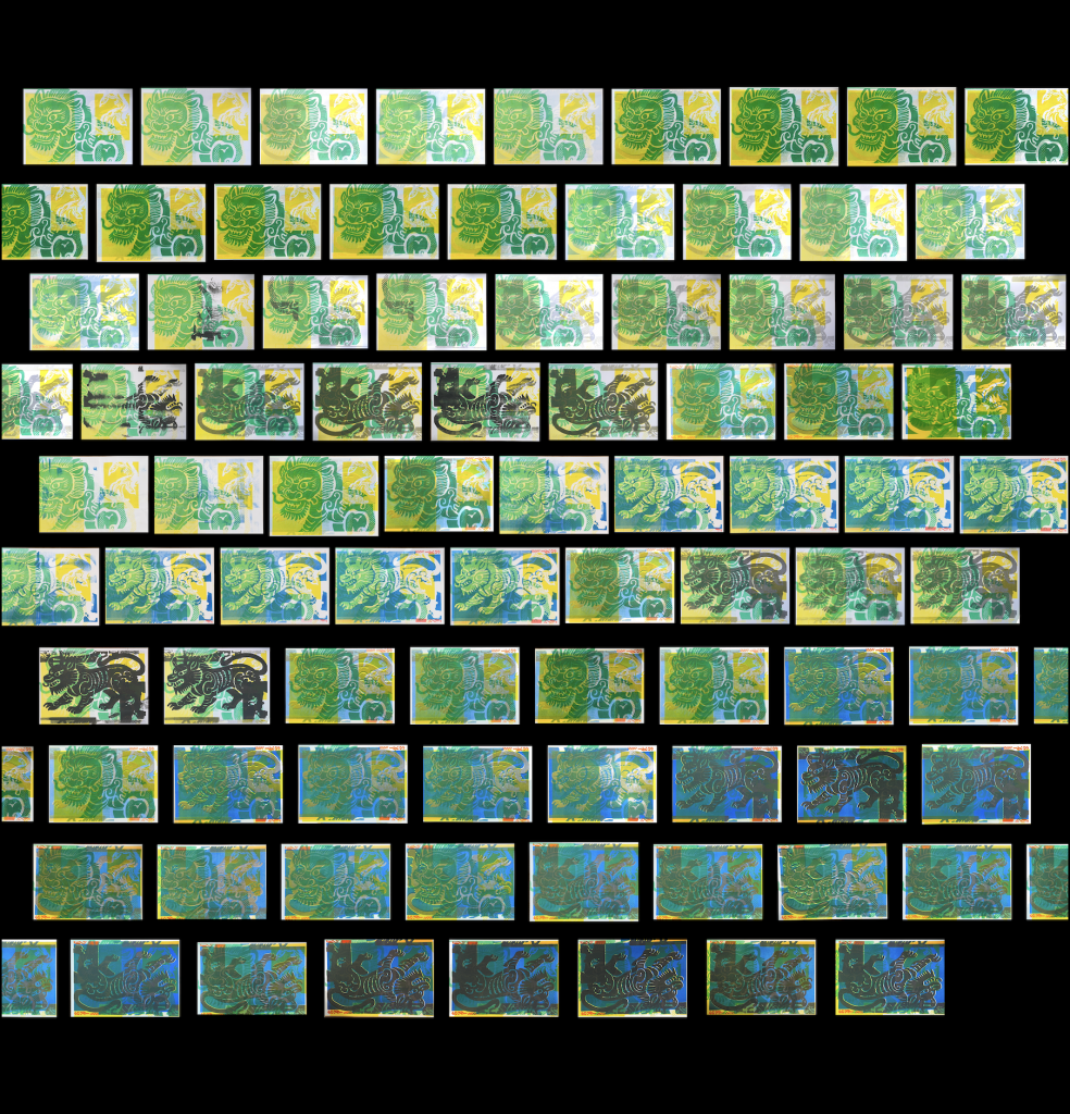
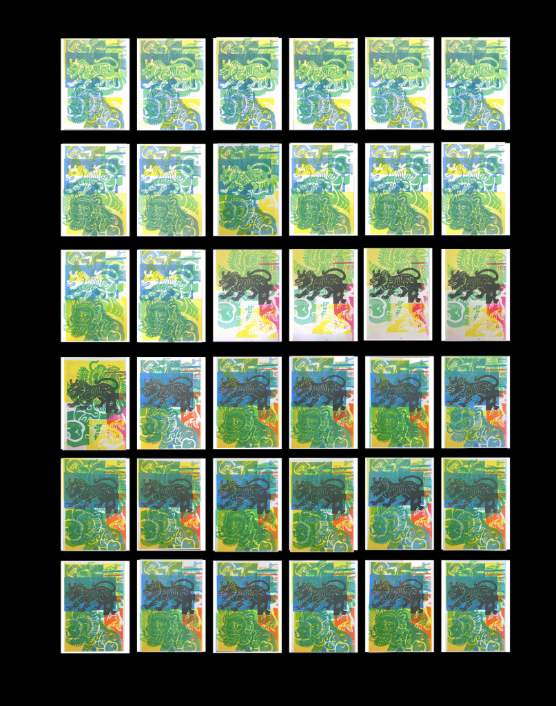
So during the first set of iterations, I reused the content I had iterated on last week. During the iteration process, I adjusted the positions; for example, the green colour moved to the left and the yellow colour moved to the right. During this set of iterations, I found that if the colour saturation of the background was low, people’s visual centre would still be on the lion. However, as the saturation continued to increase, the patterns on the lion began to be influenced by the original design, and even in the high-saturation works, the visual center I originally hoped to be the lion gradually faded and even became a watermark.
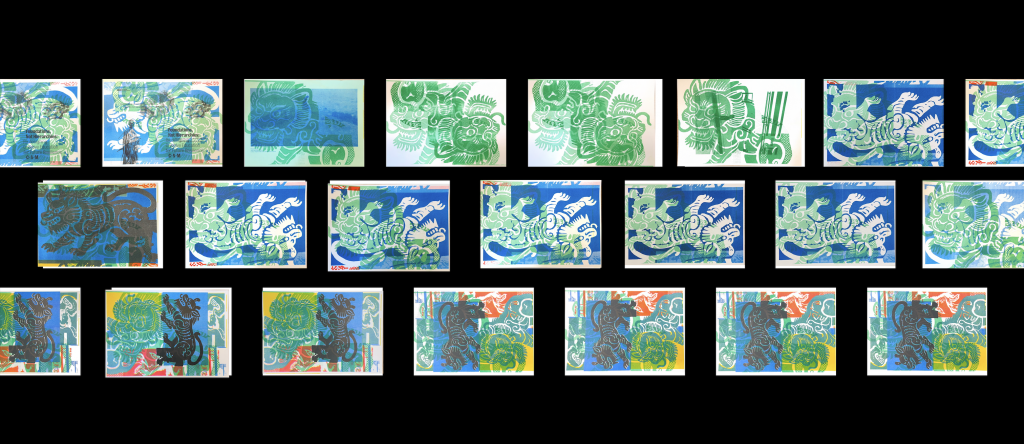
This group shows the situation where I manually created yellow ink cardstock and instructed the machine to print on the green area.
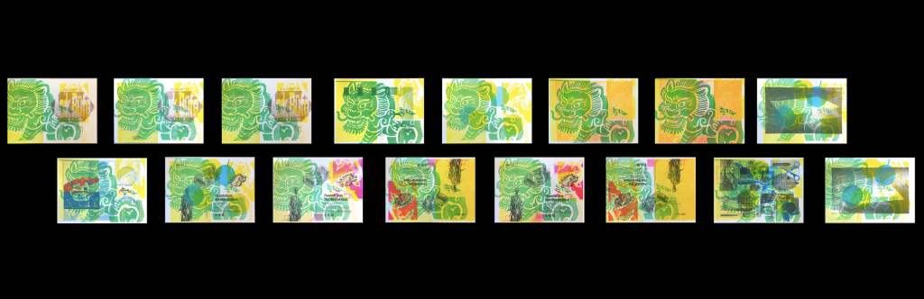
This group is an attempt of mine to print my own work based on someone else’s creation. Let’s see if two completely unrelated things will change the visual center that I am striving to present to the audience.
This group shows that when the original work already contains a lot of information, the iterative effect does not significantly alter people’s visual focus.
*use AI as a translation tool to help me translate from Chinese to English
Leave a Reply