There is one medium that I have never tried, but I am very interested in. I think it’s riso. The first time I learned about this printing medium was when I was making my first portfolio to apply to UAL. At that time, I wanted to make a book, but I asked many manufacturers who could print with riso, and I was stopped by their astonishing prices. So I thought this was a great opportunity to start learning about this printing method that I really wanted to try. Therefore, I will start with the background, the objects I sought to replicate, how they were made, what I discovered during the process of trying, and the questions I raised for research
Background
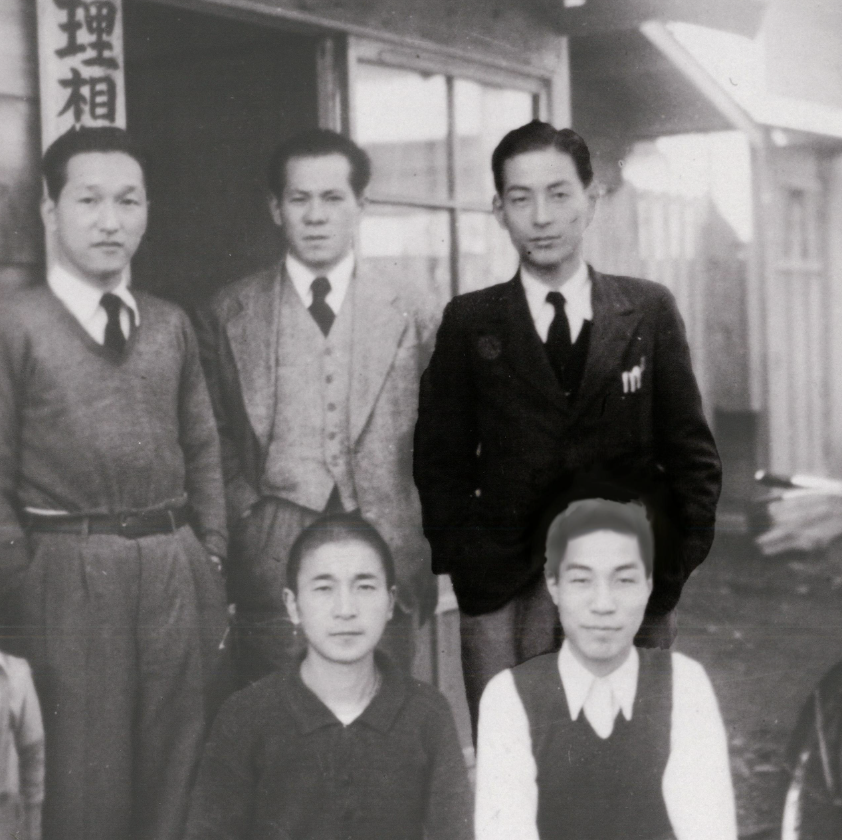
Noboru Hayama actually operated far away from the print industry. As the only son of an officer, his destiny was a successful officer’s career in World War II, defending Japan. But the sudden end of the war opened up entirely new opportunities for him and his innovative mind – a success story in printing.
Noboru Hayama opens his own mimeography printing company: RISO-SHA (理想 社 = Ideal Company). RISO (“Ideal”) was chosen under the strong impression of the war. The founder wanted ideals to be preserved in his company. He saw no future for the people of Japan without ideals.
The family business, known for its quality and in demand, moves into a sales office in Tokyo’s business district. At the same time, it was also renamed RISO Insatsusha 理想 印刷社 (“RISO Printing Company”).
After I have a comprehensive understanding of Riso, and because Riso also has a unique creative background, I was wondering whether I was engaging in a dialogue with Riso’s restrained local creative history or merely using its popular colour aesthetics. With this question in mind, I began to search for what kind of works would suit me to iterate.I didn’t choose a very famous artist. However, the fact that this designer chose Riso to represent the essence of his design philosophy deeply moved me. That’s why I chose his work.
Choosing a project
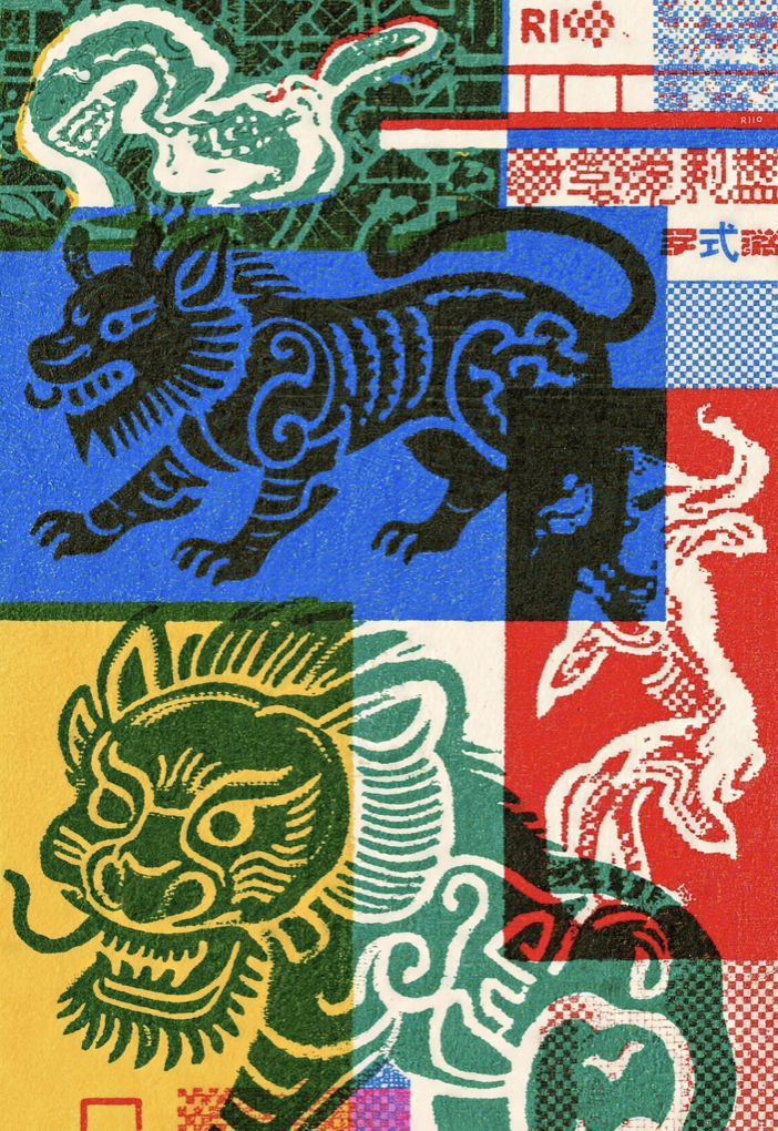
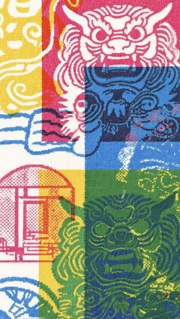
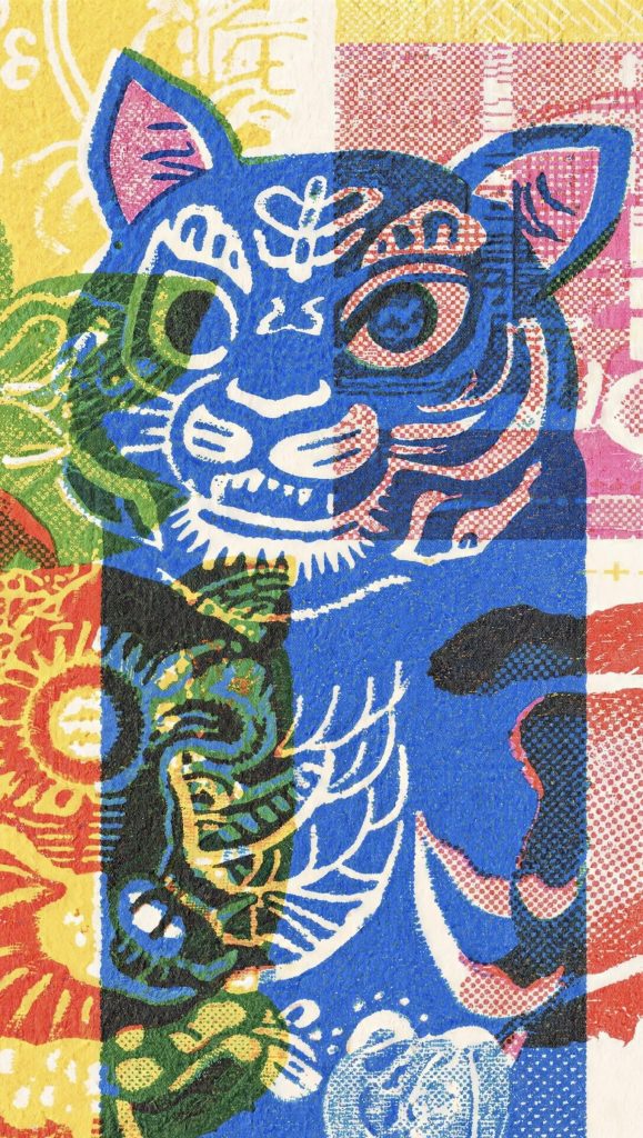
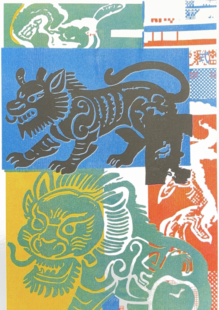
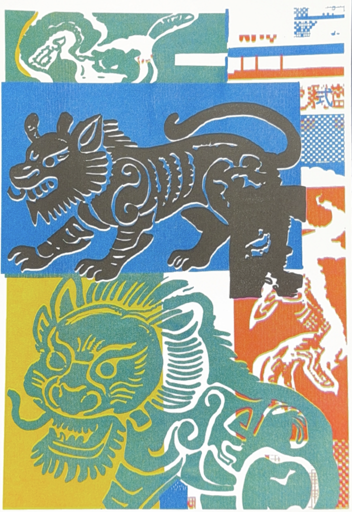
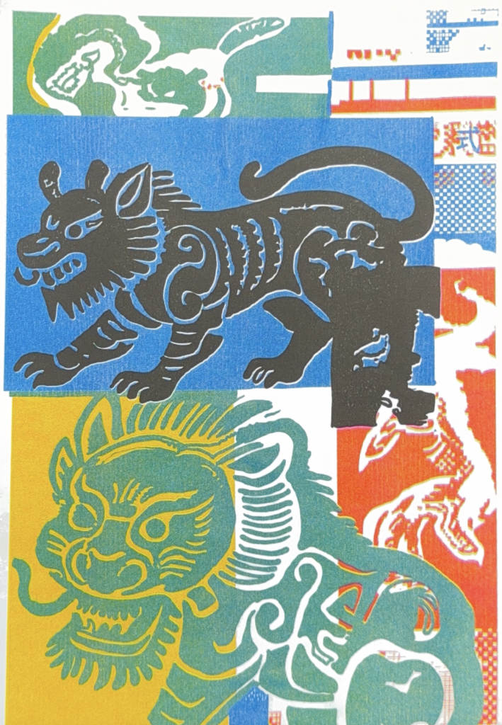
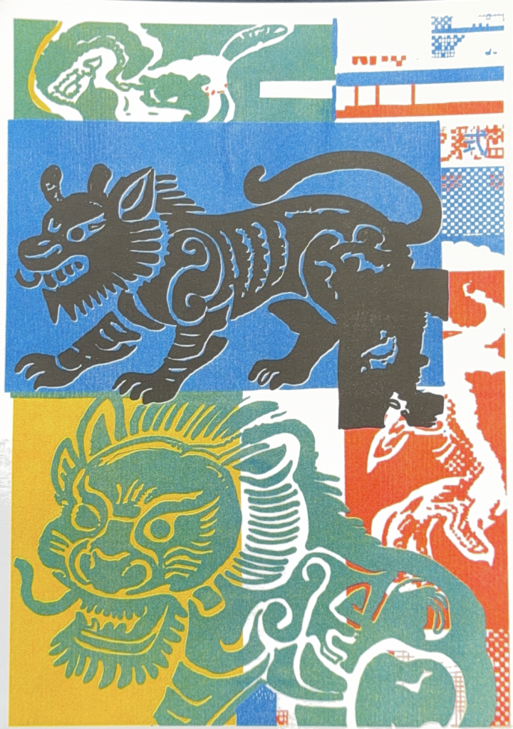
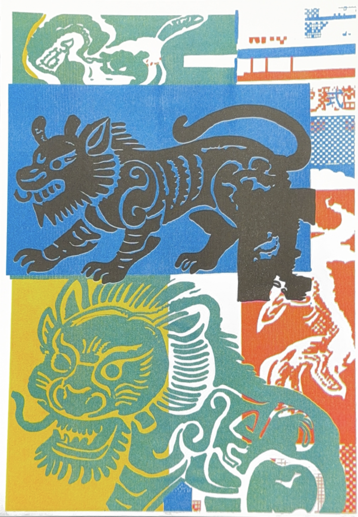
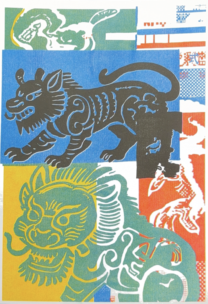
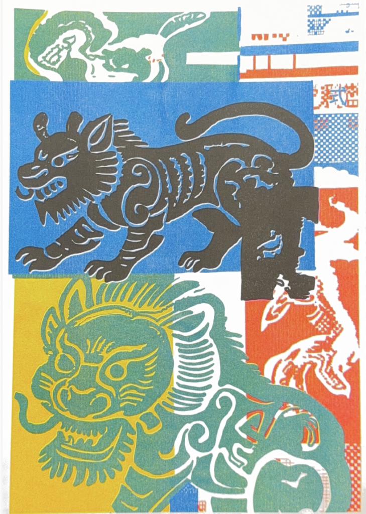
What this designer do is remake Chinese New Year Pictures. This is because most of the folk print art in China is used for New Year paintings during the Spring Festival, but now only a very small number of rural areas still follow this tradition. This designer believes that although Riso has only 17 colours, it can print out very distinctive and vivid colours. He hopes to use this technology to recreate traditional Chinese folk woodblock prints. And with Riso’s unique layering and blending method, he intends to use Eastern patterns to bring this traditional Chinese culture, which is rarely used during the Spring Festival now, back to the current young people.
Remaking
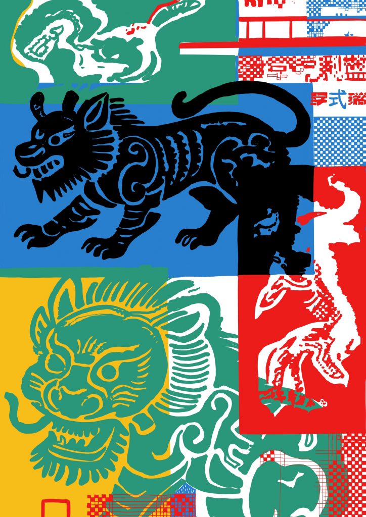
At the very beginning, I used the pen tool in Illustrator. However, during the process of creating, I realised that this pen tool couldn’t accurately depict the soft brushstrokes of the animals. So, I chose to use Procreate and replicated it through drawing.

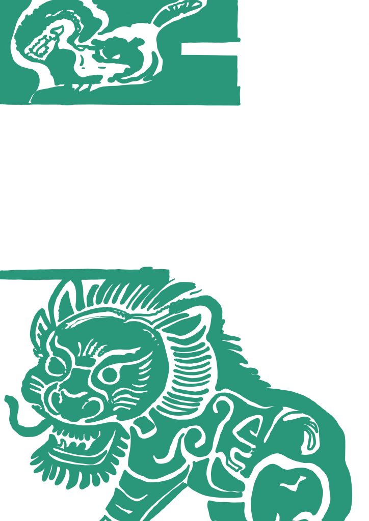
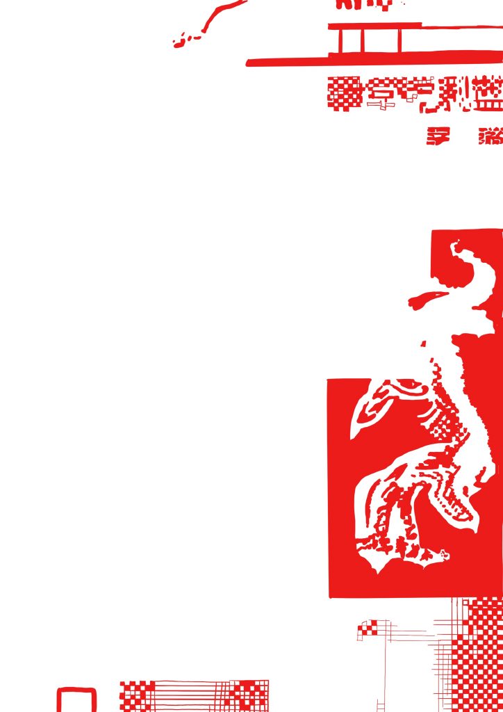
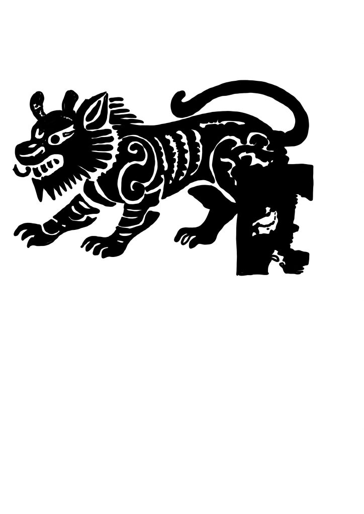
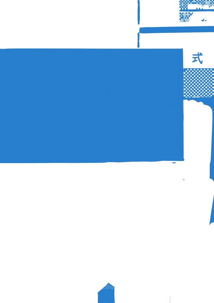
Through Google and YouTube, I gained a basic understanding. I learned that Riso needs to separate the colours, but I don’t know exactly how to do it. So, I achieved the effect of layer separation by dividing the painting in Procreate into layers and then exporting them one by one.
How Riso works & helps me to reach my outcome
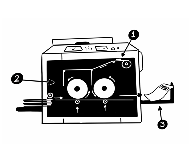
When you scan or upload an image to the machine, it first makes a paper stencil and wraps it around the ink drum – these are called masters. Paper is placed on the feeder and passed through one or two of the ink drums. The machine creates a ‘digital’ stamp of individual colours (which are incredibly vibrant!), and together they create a colourful image.
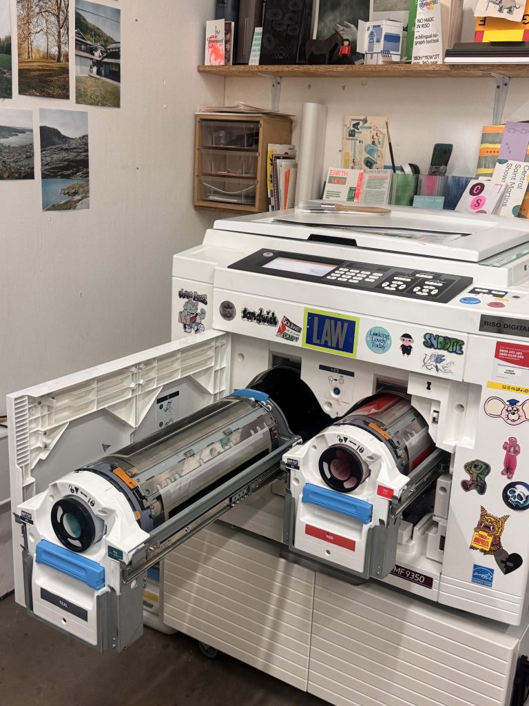
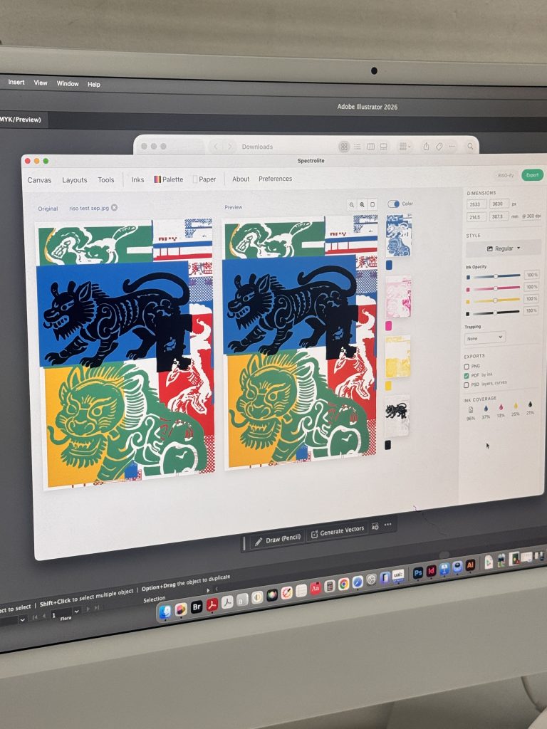
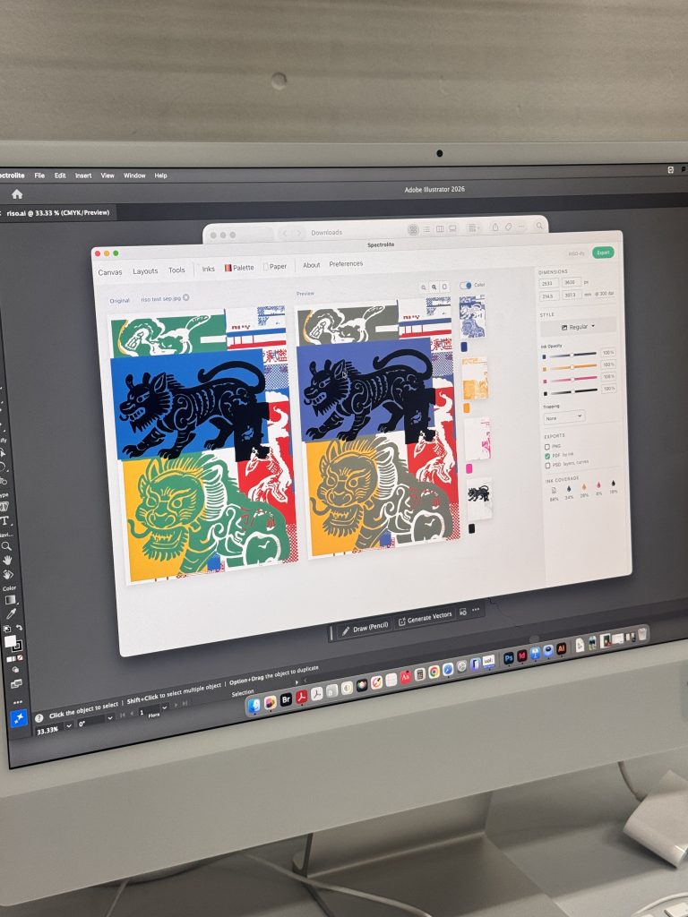
After arriving at the digital workshop, I found that the colour of Riso should ideally be divided into no more than 4 colours. This is done through CMYK, using proprietary software called Spectrolite for pre-processing to ensure that Riso can closely approximate the colour of the electronic document. This app can effectively help us predict whether our results are close to the ones we expected. Then, through the colour chart and this app, we can constantly adjust and compare our colours to see if they are the same as the ones we envisioned.
The main reasons why it is not recommended to divide into more colours are as follows. Firstly, the misalignment of the first set of printing will become exponentially worse. For each additional colour, the paper needs to go through the machine one more time. Every time the paper is fed in, there is a probability of being slightly skewed; with 4 colours, the same sheet of paper needs to be sent through the machine 4 times. Beyond 4 colours, the misalignment will accumulate uncontrollably, and your dots and outlines will not match at all, and the details will simply smear out.
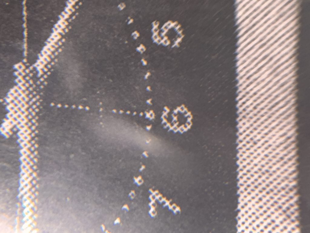
Secondly, soy ink is transparent, and overlapping colours are prone to getting dirty and greyish. Riso’s ink is semi-transparent, and when too many colours are overlapped, the colour mixing will not be as clean and smooth as on the screen. It is easy to end up smearing into a dirty patch, and the colours are difficult to predict.
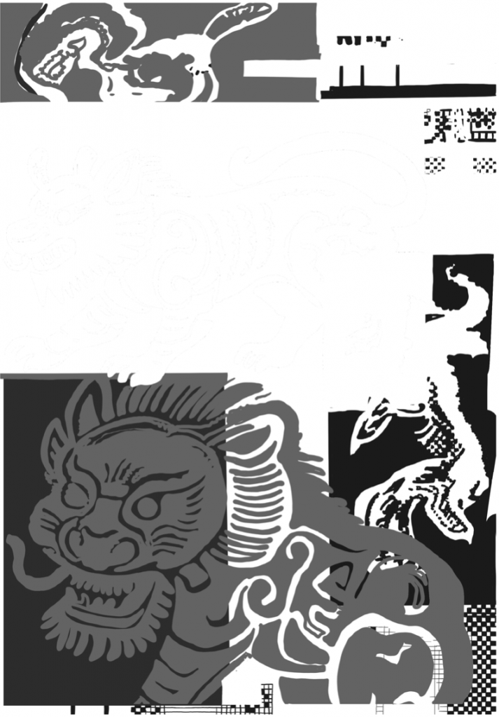
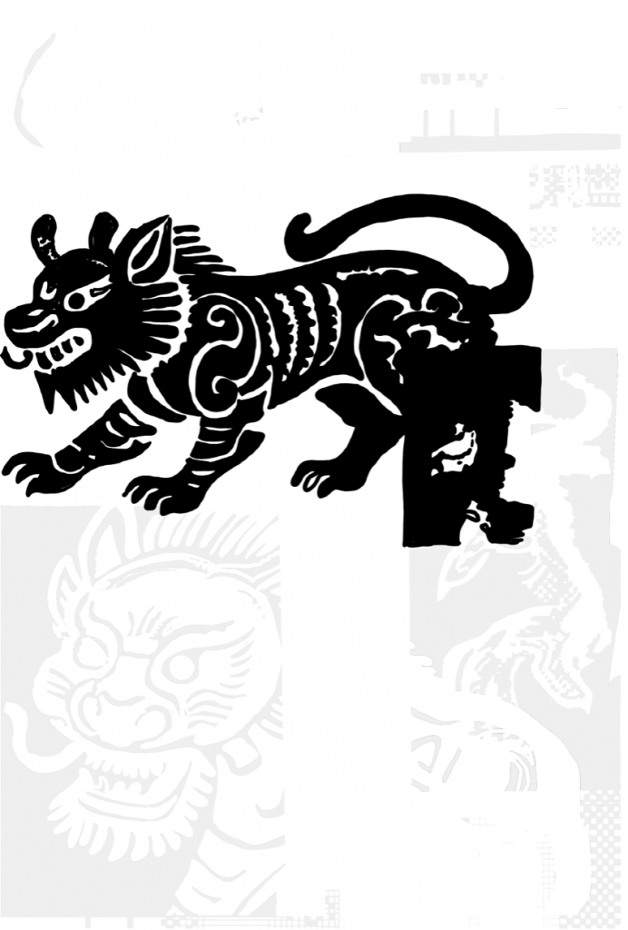
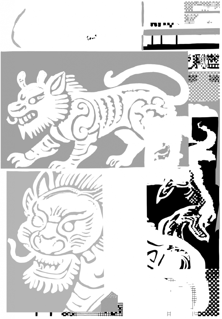
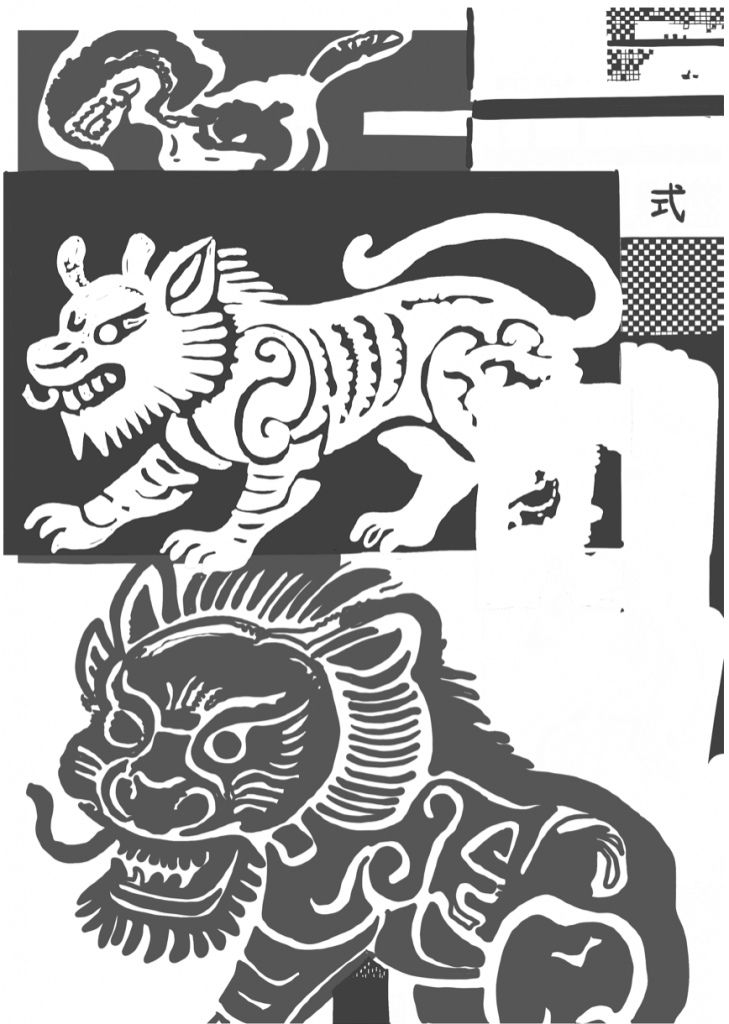
it is worth mentioning that since Riso’s heat-sensitive paper is attached to the ink roller, after the old version is torn off, the old ink that has seeped into the roller sponge will slowly spread out through the pores corresponding to the graphics on the previous version of the paper. Moreover, the new ink has not yet fully covered the previous ink, so faint imprints of the previous pattern will be visible on the surface.
Additionally, it does not have a high-pressure cleaning structure. The remaining ink in the sponge cannot be completely cleaned, and it will gradually be removed by the new ink after printing about a dozen sheets. This is because, in the initial background introduction, the birth of this machine was due to the need to make cheaper printing machines accessible to more people. There were also some uncertainties that arose during the creation process of Riso.
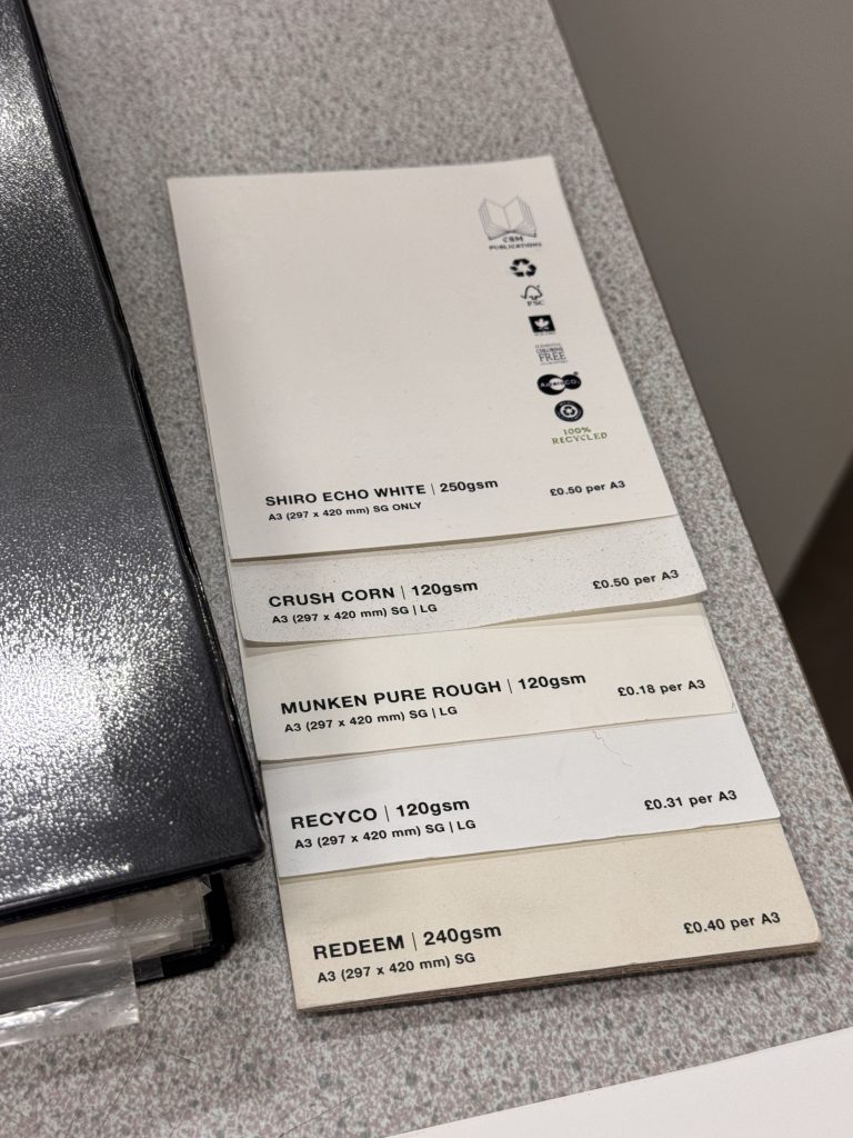
Paper is a key variable for Riso outcomes. Highly absorbent paper makes ink spread and softens dots, while compact, low-absorption paper delivers sharper, brighter colour, though ink dries more slowly and smudges easily. Riso works best with uncoated paper. Coated stock like art paper struggles to hold soy ink and smears badly. Overly thick, stiff paper or extremely thin paper may cause jams, paper stretch and worse misregistration.
Testing my project
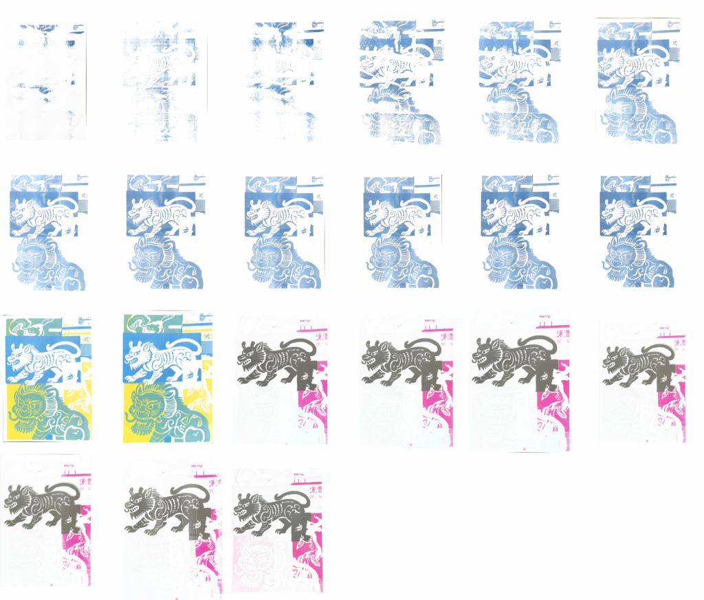
The Riso machine requires a warm-up period, and since it had not been used for some time, I carried out continuous test prints to heat it up. Colours gradually appeared throughout this process. Meanwhile, to align the printed colours and line positions with my digital design as closely as possible, I adjusted the machine’s controls during testing for calibration.
Out come
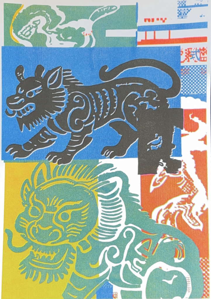
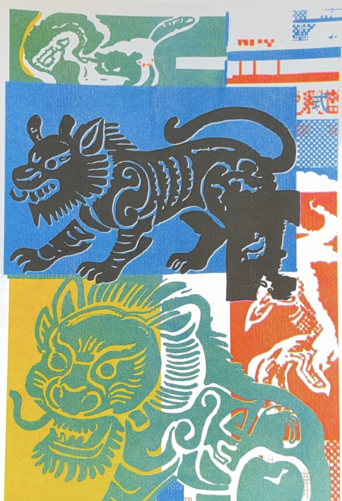
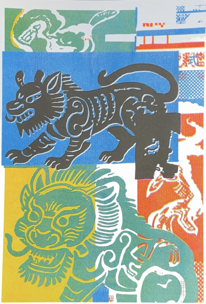
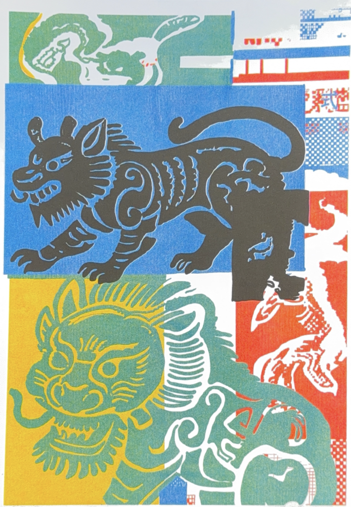
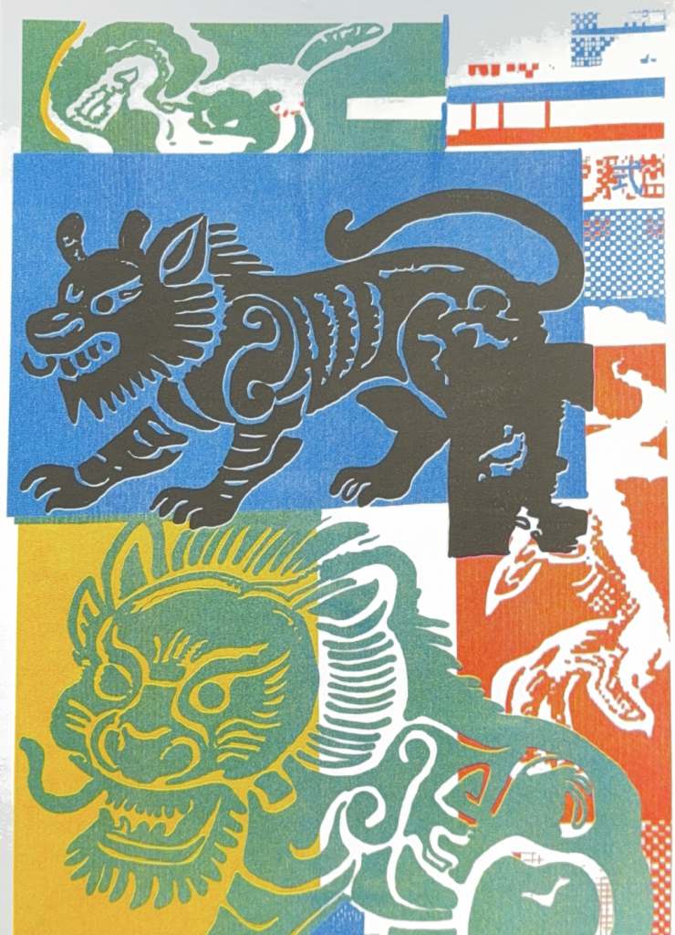
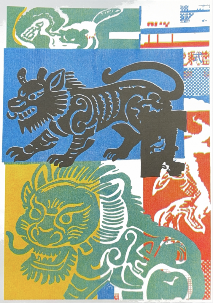
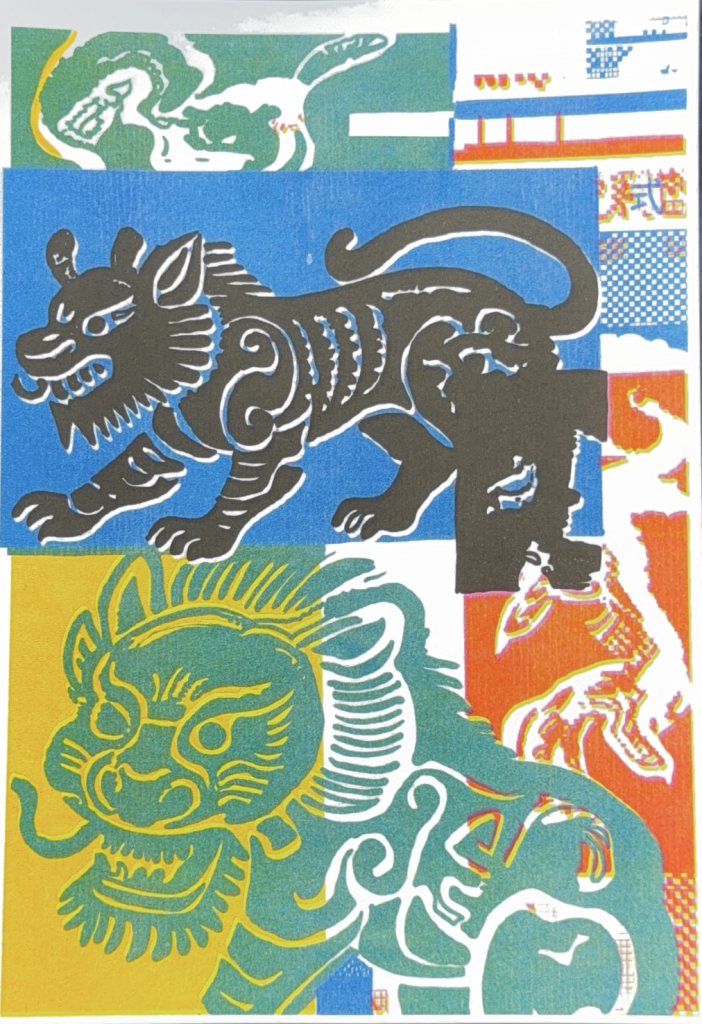
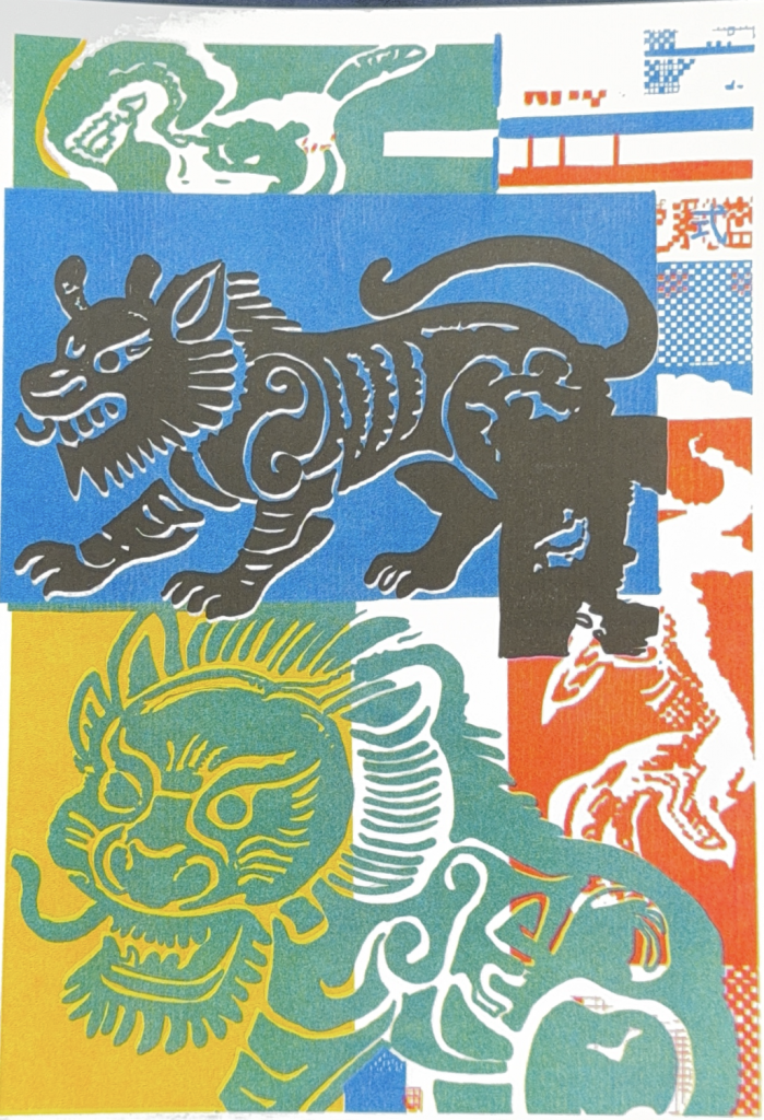
In the final prints, accidental traces on the kylin stand out distinctly, with many unexpected blank areas emerging across the composition. Throughout the printing process, I only intervened once to adjust the position of the lines. Beyond this single adjustment, I chose not to correct the machine’s deviations further, intentionally creating space for the medium’s inherent unpredictability. The black layer shifted out of registration, and pink ink spilt past its intended outlines. These marks were not pre-designed in my digital file; they emerged naturally from the interaction between the Riso machine, soy-based ink and paper.
Critical Question
The inherent uncertainty of the machine throughout the printing process leads me to this question: How does the inherent uncertainty of Riso printing shape and disrupt the intended expression of colour? Are these accidental colour traces only decorative texture, or do they reveal the material qualities of the medium?How does the inherent uncertainty of Riso printing shape and disrupt the intended expression of colour
FeedBack
This discussion focuses on experimental approaches to Riso animation. Riso comes with two constraints: a minimum run of ten prints set by the workshop, and the medium’s inherent rigidity, which makes fine iteration difficult. Many practitioners split one master sheet into a grid, with each section serving as an animation frame. Colours and graphics can be adjusted separately for each frame, and the kylin design does not need to stay identical across frames. Max advised against rigidly following the 25-frame standard of digital animation; this grid layout supports structured variable tests.
Controllable variables include colour separation, overprinting order and paper stock, which alter the look of prints. Uncontrolled material traces such as misregistration and residual ink also emerge, and excessive colour layers tend to muddy the image.
Two further experiments were proposed. The first is a comparison test between culturally loaded imagery like the kylin and neutral graphics, to examine how cultural context shapes readings of accidental print marks. The second explores overprinting on workshop waste paper. This sustainable practice echoes Riso’s origin as a frugal, resourceful duplicator.
These tests investigate Riso’s colour reproduction and the tension between intentional choices and accidental marks. They feed into my core research question: am I only using Riso for its aesthetic texture, or engaging with its history of modest, resourceful local making? Tight parameter control for polished animation falls into the former, while embracing imperfections and waste paper aligns with Riso’s material roots.
Leave a Reply