Draft 1
Initially, I understood Riso merely as a graphic printing medium commonly used for posters and books. I only recognised it for its distinctive visual style, rather than its material working logic.
To establish my creative framework, I studied artists whose practice is entirely focused on colour. His work adopts Riso’s unique overprinting technique and vivid colour to revive fading traditional Chinese visual aesthetics within a contemporary printing context, in order to reintroduce this culture to the younger generation. After analysing and referencing their colour strategies, I conducted small-scale preliminary experiments focused on colour variation under Riso’s inherent limitations.
In order the better understand how a RISO machine works, I go to the workshop to help me get more information on it printing process. It only allows two colours per print run; the overprint order drastically alters the final tone, and different screen dot patterns and paper stocks further reshape colour outcomes. During the printing process when it comes to text my outcome it reveal that minor adjustments in colour separation, printing sequence and paper texture generate entirely different visual effects. For example, during my iteration, black structural layers often misalign, while pink ink frequently bleeds beyond its intended boundary, producing unplanned colour traces that never appear in my digital design.
So I was wondering: these minor colour irregularities carry cumulative potential. Small shifts in tone, ink bleeding and misregistration do not merely alter static prints; they can gradually reshape visual rhythm, colour balance and atmospheric expression across sequential frames.
Through preliminary research, I narrowed down my core enquiry: how does the inherent uncertainty of Riso printing shape and intervene in the expression of colour?
Draft 2
During last week’s replication and iterative practice, I observed that the Riso machine and its software alter colour representation. The designer I studied uses Risograph’s special colour and textures to express traditional Chinese culture. After last week’s exploration, I realised that the RISO machine itself can affect colour through different dot sizes, which colour prints first, and the colour from the colour card. This inspired my research question: How does the Risograph machine affect the expression of colour?
Building on my earlier finding that Risograph cannot perfectly replicate digital on-screen colours, this week I ran iterative colour tests. My methodology draws inspiration from Raymond Queneau’s Exercices de Style, while Barbara Bolt’s theory of the excess of materiality forms my theoretical foundation.
For the first iteration, I controlled the graphic, machine and ink, only changed the halftone density as my variable. Using tinkering, I systematically adjusted halftone values from 100%, 85%, 70%, 50%, to 25% within the tool’s parameter range. This allowed me to track how ink volume changes saturation and print texture. To deepen my investigation, I adopted hacking in the second iteration. Keeping ink density at 100%, with unchanged paper and machine, I manually shifted print plates and reordered ink layers to introduce some movement in the printing process.
Riso inherent instabilities, such as colour shift and misaligned dots, are normally trapped on static sheets. Therefore, I use frame-by-frame animation to add a temporal dimension. When these printed traces are sequenced into moving images, material excess unfolds continuously over time instead of existing only as isolated static flaws (Barrett and Bolt, n.d.).
From the experiments, I found that reducing halftone density gradually transforms solid colour blocks into halftone textures, amplifying uneven printing marks. In the second iteration, manual plate displacement reduces image legibility. Changing printing order also reshapes hue: yellow printed beneath red creates standard red with precise registration, but misaligned layers physically blend to produce an unexpected orange tone. I conclude that Risograph, as a physical printing system, generates outcomes beyond digital previsualisation. Material forces do not merely create surface texture or ink pooling; they can reshape hue itself.
Reference
Barbara Bolt, ‘The Magic is in the Handling’, Practice asResearch: Approaches to Creative Arts Enquiry, 2019
Raymond Queneau, Exercises in Style, [1947] 1998
Draft 3
In conventional design practices, designers expect machines to accurately show their ideas, including accurate colours, lines, and compositions. However, during the past two weeks, I have discovered that riso printing is difficult to replicate electronic drafts perfectly, especially in terms of colours and their positions. Even if I attempt to achieve the best results through manual adjustments, these adjustments still require human intervention, along with continuous iterative adjustments by the machine, such as adjusting green downwards and black to the left. Or changing the printing sequence, like printing green first and then red, in order to optimise the visual centre.
During the previous two weeks, after I mastered how to tame the machine and approach precision, I began to reflect on how every designer is following the goal of pursuing precision, such as riso printing not being able to change the printing order each time, paper jams requiring the ink to be removed, and waiting for all colours to dry before printing other colours. This week, I wonder if giving up the expectation of precise pre-set results and deliberately introducing uncontrollable and unpredictable elements, such as printer jams, others’ works, and previously discarded works, could change the visual centre? Therefore, in order to conduct better experiments, I proposed how the riso machine can challenge the uniformity in traditional design. How to move from clean, authoritative design towards a decentralised goal?
In order to better carry out this experiment, I will adopt Barbara Bolt’s theory of excessive materiality as my theoretical foundation. First, I will print out the draft and obtain its initial form. I will conduct further iterations by comparing the previous printed results with those of others, actively creating colour deficiencies and breaking the printing rules.
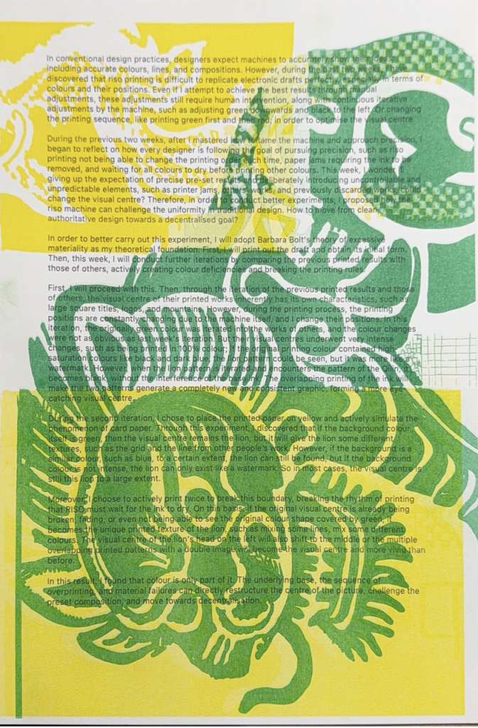
First, I through the iteration of the previous printed results and those of others,。 It is because introducing uncontrollable and unpredictable factors can, to some extent, alter the course of events.(Maurer et al., 2013, p. iv) The visual centre of their printed works inherently has its own characteristics. However, during the printing process, the printing positions are constantly changing due to the machine itself, and I change their positions. In this iteration, the originally green colour was iterated into the works of others, and the colour changes were not as obvious as last week’s iteration. But their visual centres underwent very intense changes, such as being printed in 100% colour; if the original printing colour contained high- saturation colours like black and dark blue, the lion pattern could be seen, but it was more like a watermark. However, when the lion pattern is iterated and encounters the pattern of the Qilin, it becomes blank, without the interference of the base ink. The overlapping printing of the ink will make the two patterns generate a completely new and consistent graphic, forming a more eye-catching visual centre.
During the second iteration, I chose to place the printed paper on yellow and actively simulate the phenomenon of card paper. Through this experiment, I discovered that if the background colour itself is green, then the visual centre remains the lion, but it will give the lion some different textures, such as the grid and the line from other people’s work. However, if the background is a similar colour, such as blue, to a certain extent, the lion can still be found, but if the background colour is not intense, the lion can only exist like a watermark. So in most cases, the visual centre is still this lion to a large extent.
Moreover, I choose to actively print twice to break this boundary, breaking the rhythm of printing that RISO must wait for the ink to dry. On this basis, if the original visual centre is already being broken, fading, or even not being able to see the original colour shape covered by green, it becomes the unique printed texture of the lion, such as mixing some lines, mix some different colours. The visual centre of the lion’s head on the left will also shift to the middle or the multiple overlapping printed patterns with a double image will become the visual centre and more vivid than before.
In this result, I found that colour is only part of it. The underlying base, the sequence of overprinting, and material failures can directly restructure the centre of the picture, challenge the preset composition, and move towards decentralisation.
Reference
Barbara Bolt, ‘The Magic is in the Handling’, Practice asResearch: Approaches to Creative Arts Enquiry, 2019
Maurer, L., Paulus, E., Puckey, J. and Wouters, R. (2013). Conditional Design Workbook. Amsterdam: Valiz.
Raymond Queneau, Exercises in Style, [1947] 1998
* use AI as a translation tool to help me translate from Chinese to English
Leave a Reply