In order to better address the issues identified during the iterations, this week we will further utilise the Riso machine for more in-depth iterations. The current iteration will focus on conducting further research on the color itself and the changes made by the RISO machine.
During the research last week, I discovered that the RISO machine has a significant impact on the expression of colours. Therefore, I raised the question of whether the Riso machine has any influence on colours. So this week, I have two different ways of using the Riso machine. One is through the app called Spectrolite, which is used to view the Riso effect on a computer, and one can manually change the opacity to artificially alter the colour. Additionally, by referring to the colour cards provided at the school’s workshop, I found that individual colours can be iterated, and during the iterative process, from high-saturation colour blocks to the iterative effect on the printing dots, it helps me to make further iterations. Secondly, during the use and learning of the Riso machine last week, I noticed that we needed to manually adjust the machine to achieve better performance. So I wondered if pursuing imperfection artificially could better express the influence of the Riso machine on colours, and whether changing the order of printing would also have an impact. Therefore, this week I will conduct further research based on my two hypotheses.
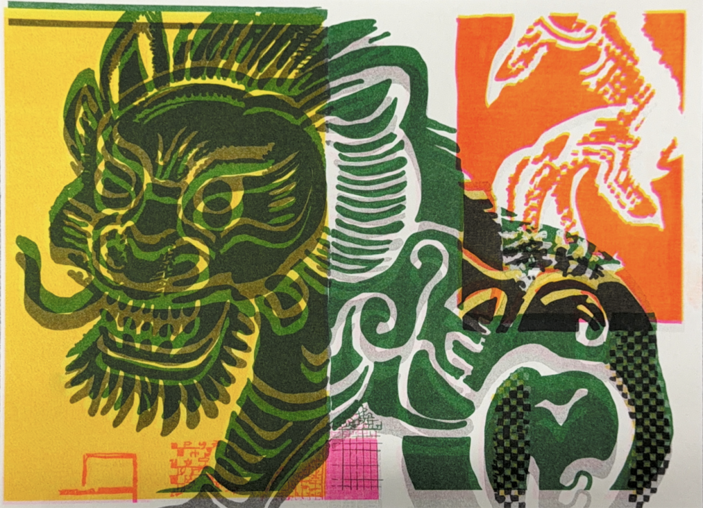
In order to further magnify the details, I have extracted the two main subject elements, the “Qilin” and the “Dragon”, from the picture to observe their performance by the machine in greater depth.
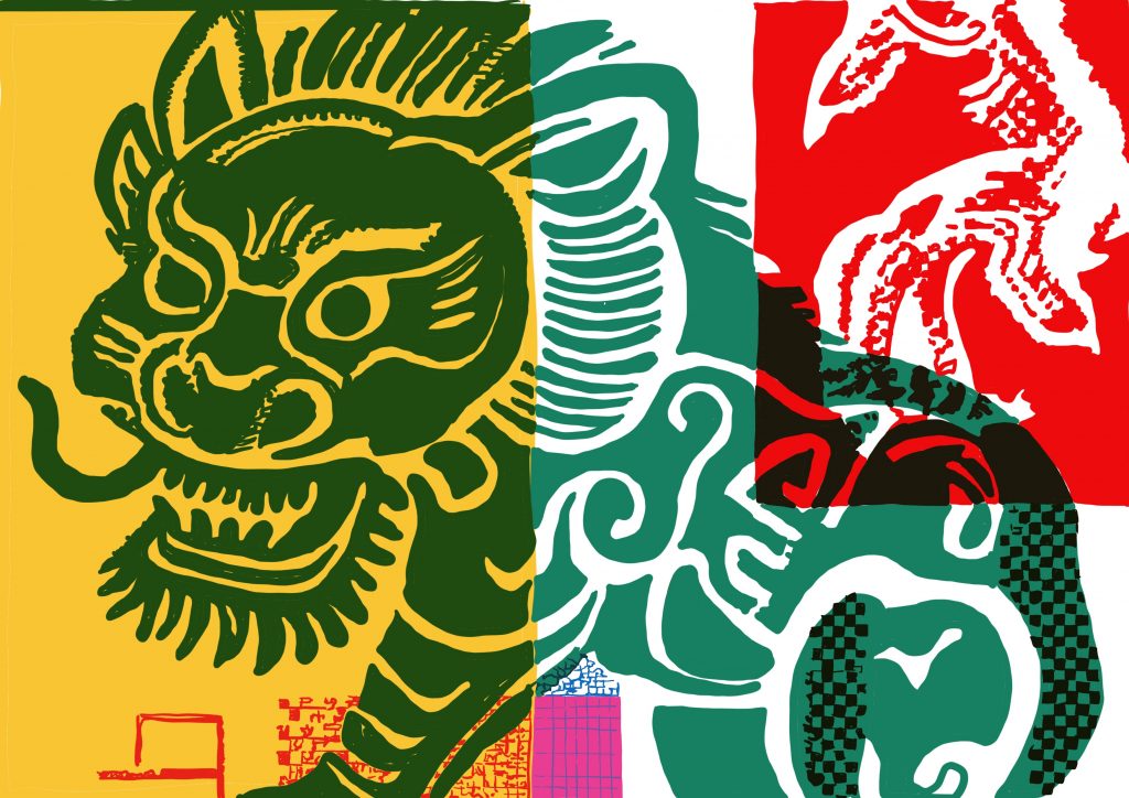
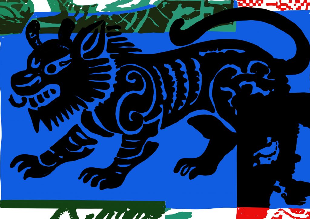
Color iteration – tinkering
I aim to visualise the material properties of the Risograph. Its soy-based ink accumulates on paper: thicker ink creates sharper halftone dots, while thinner ink produces sparser dot patterns. Printed halftones develop physical artefacts absent from the digital file, including dot merging and drop-out, which are especially common in low-density areas and create unique grainy textures. To confirm these contingent visual effects are generated by the Risograph machine itself, I keep paper stock, ink colour and printing sequence consistent for further iterations.
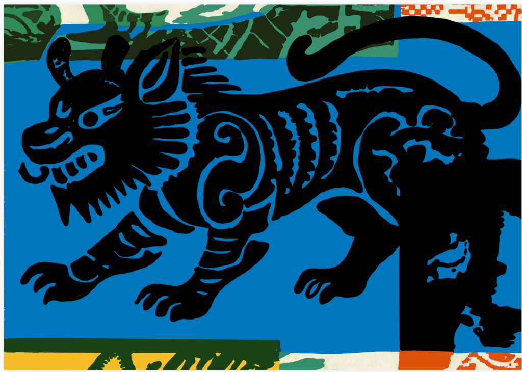
the digital version
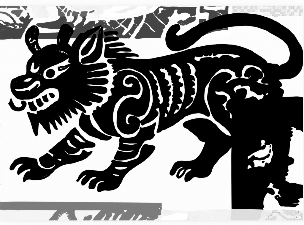
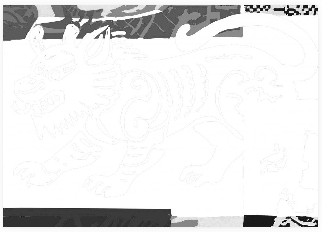
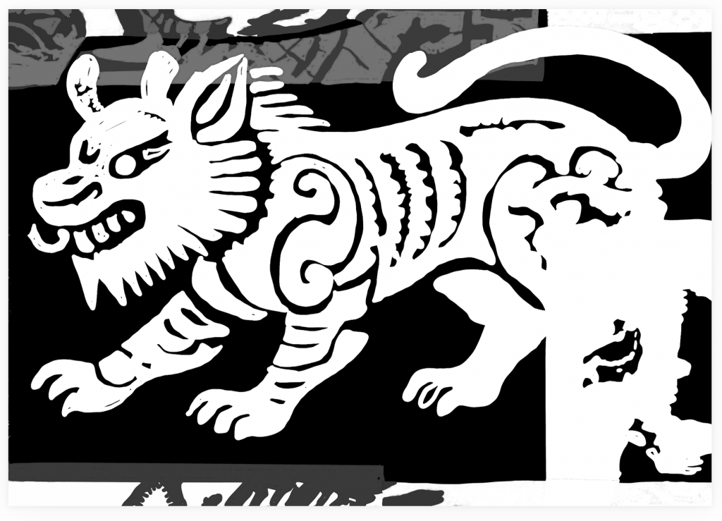
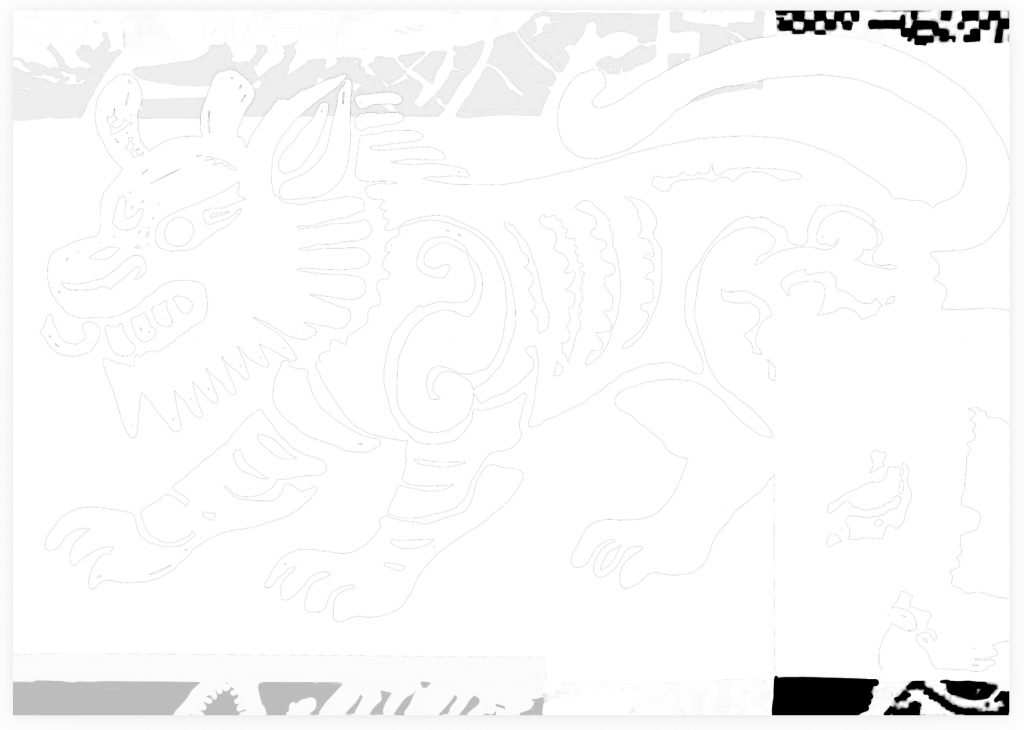
four different masters of the first iteration
This set of samples demonstrates that, with paper, ink, printing sequence and motif kept constant, halftone density directly controls the coverage of Riso soy ink on paper. As density reduces from 100% to 25%, the qilin motif fades from solid and sharp to faint, and fine details are lost in low-density areas.
Furthermore, subtle visual variations can be observed among repeated prints under the same halftone setting. This reveals the inherent contingency of Risograph printing. Physical interactions between the machine, ink and paper create traces absent from the digital file. It supports Barbara Bolt’s theory of the excess of materiality: the medium does not passively reproduce digital designs, but actively shapes the final image.
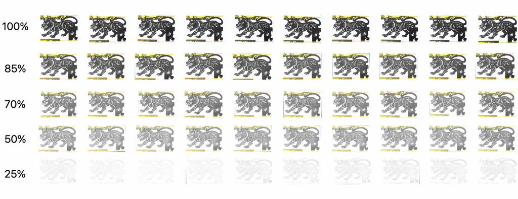
This set of iteration samples shows that the Risograph’s response to halftone density is not simply a change in lightness. As density decreases, the relationship between overlapping colours also shifts. At high density, layered inks produce complex composite tones and stronger texture. At low density, some colours fade more quickly, details weaken, and the paper surface becomes visually prominent. Even under identical settings, repeated prints show subtle differences in colour balance and ink distribution. This suggests that Risograph colour is not determined solely by digital opacity; it emerges from the physical interaction between the machine, ink layers, paper and printing process.
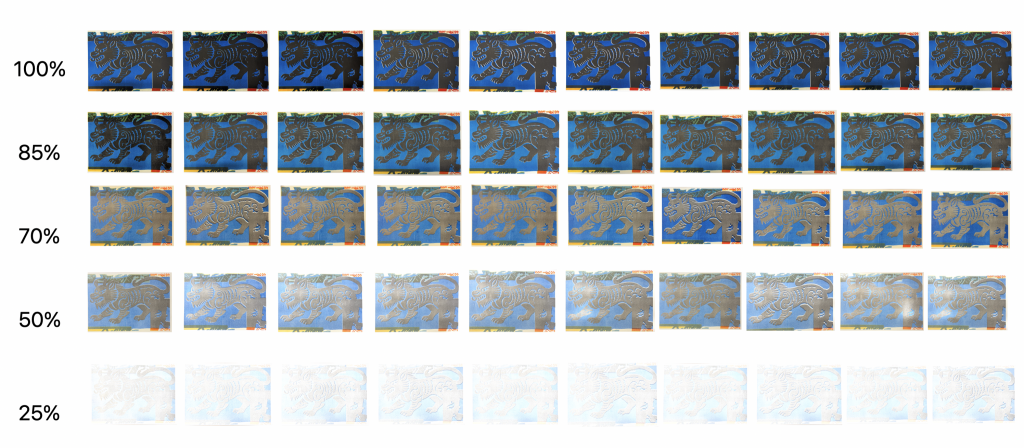
However, a single printed sample still has its limitations. Nevertheless, frame-by-frame animation can help overcome these limitations. When viewing a single Riso print piece separately, it is a discrete and static slice. The audience can only observe 100%, 85%, 70%, 50%, and 25% of the picture separately, making it difficult to quickly capture the continuity of the gradual change and not being able to clearly see how colours, dots, and details change step by step. However, frame-by-frame animation can play multiple iterative samples in sequence according to the dot gradient order, increasing the time dimension and connecting the static samples into a continuous evolution. The audience can smoothly see: as the dot concentration decreases, the rhinoceros pattern gradually becomes lighter, details disappear, the colour blending relationship shifts, and low-concentration dots start to stick together and disappear. In addition, the supporting animation can help the audience clearly see the full ink accumulation at high concentration; as the dots decrease, the ink becomes thinner, the colour blending effect changes, the graininess gradually emerges, and the details in the low-concentration area gradually dissolve.
Colour iteration – hacking
Standard Risograph printing requires precise plate registration, aiming to reproduce pre-designed images stably and accurately.
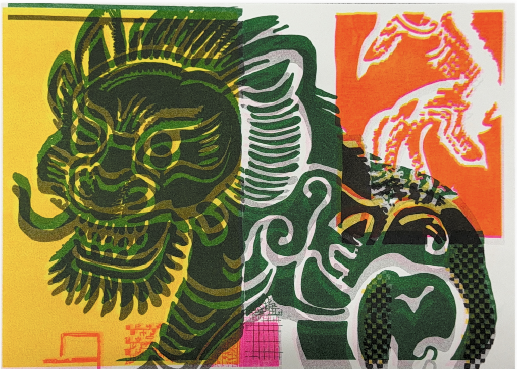
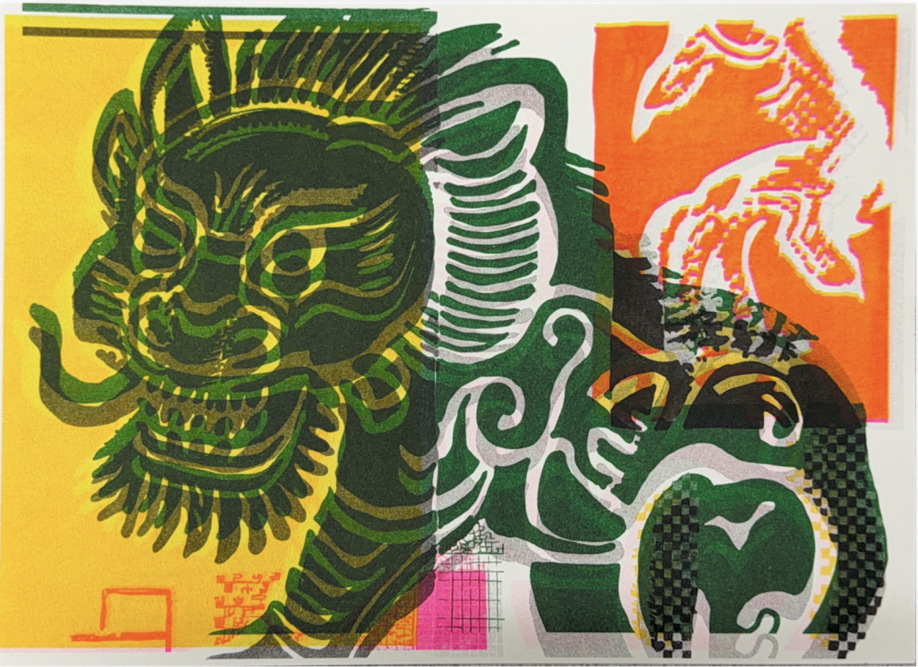
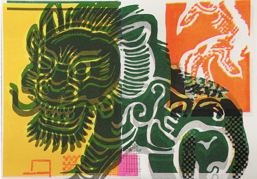
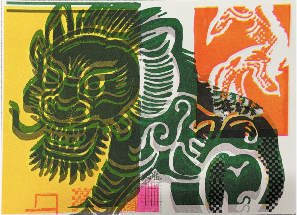
However, my project does not seek a flawless reproduction of the qilin motif. I treat plate shifting as a hacking method: without damaging the machine hardware, I intentionally break the standard registration rules.
When I manually offset the plate, multiple ink layers fail to align precisely, resulting in misregistration, ghosting, distorted edges and colour shifts.
This operation reveals Riso’s material properties normally concealed in standard printing: ink thickness, overprint sequence, paper absorption and physical interaction between halftone dots are amplified by positional displacement.
Compared with my earlier tinkering experiment (adjusting halftone density):
tinkering means tweaking parameters within the software and machine’s intended workflow, a controlled process of gradual trial and error;
By contrast, hacking (plate shifting) intervenes in the physical registration of printing, compelling the machine to produce imagery it was not originally designed to create, enabling translation of the image.
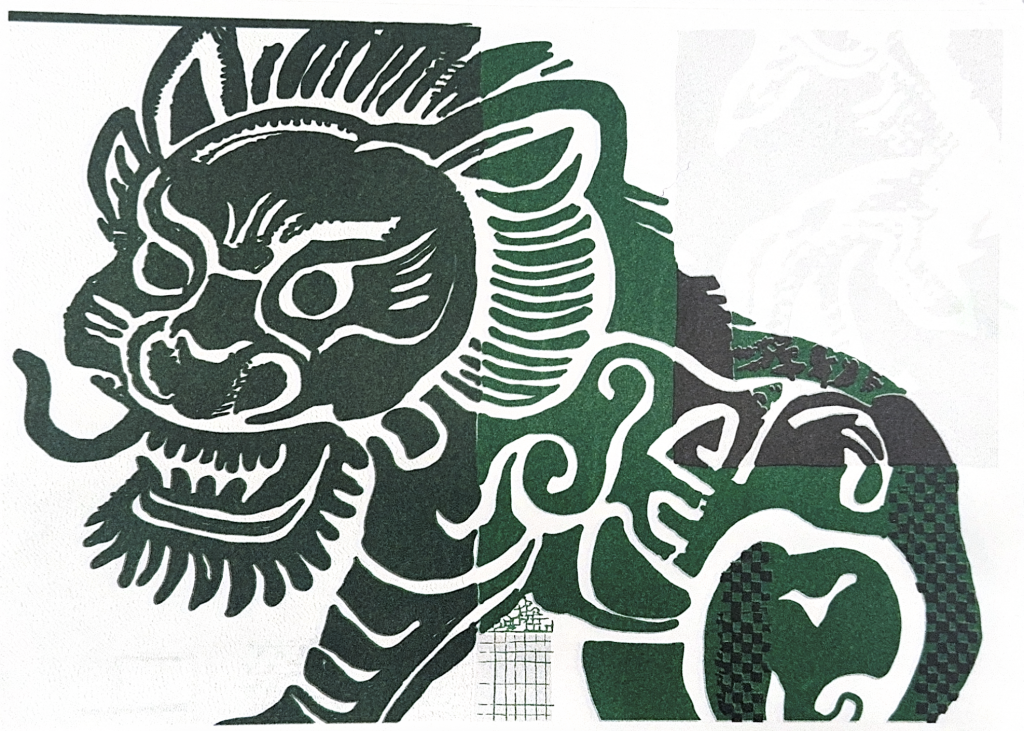
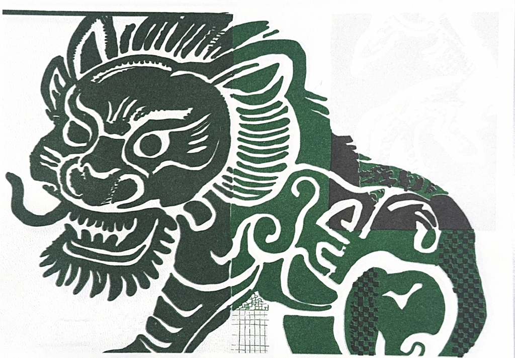
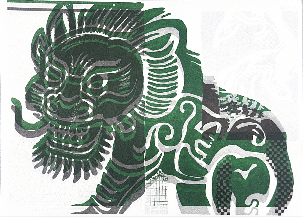
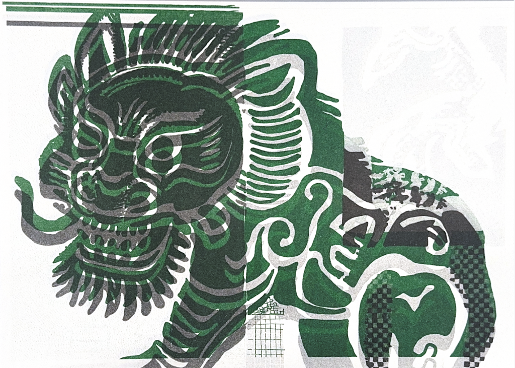
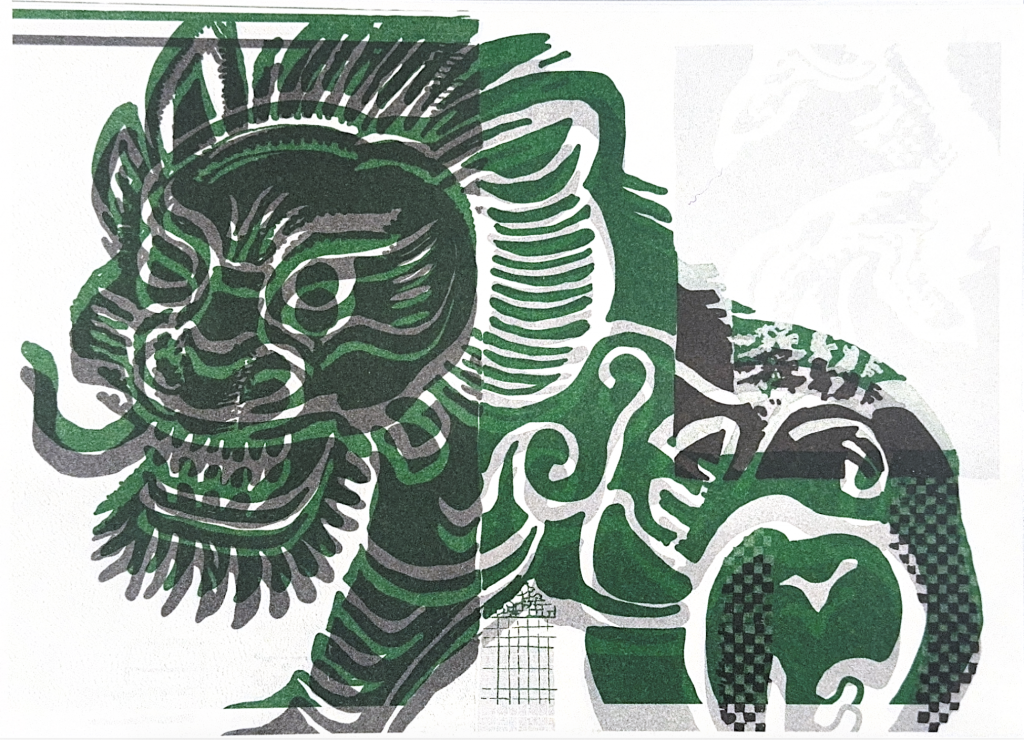
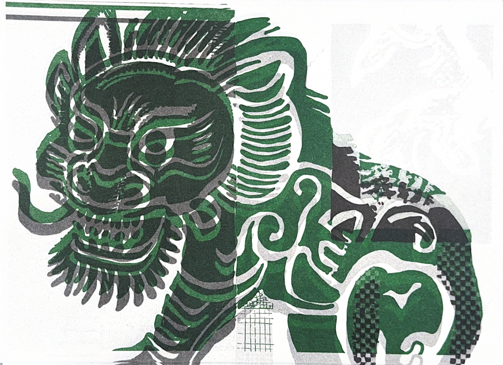
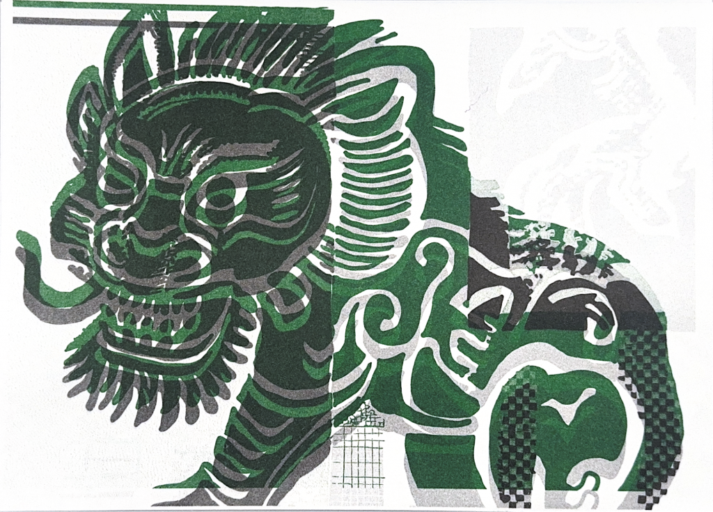
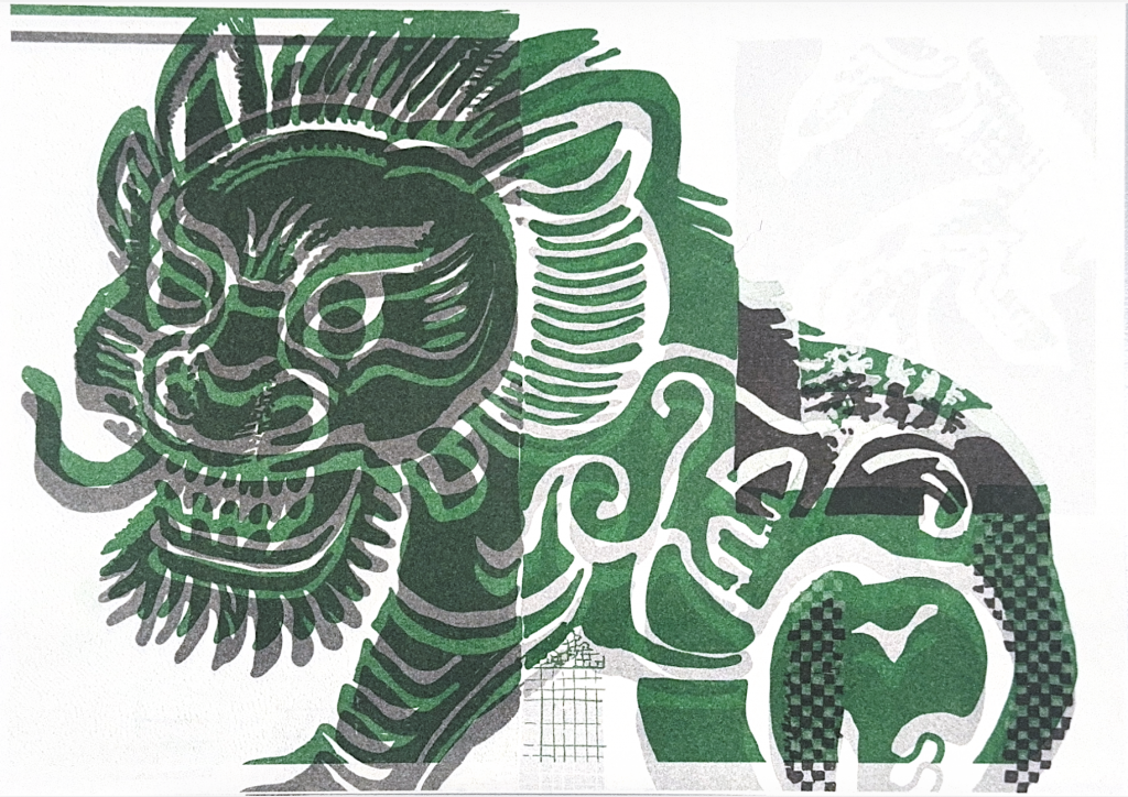
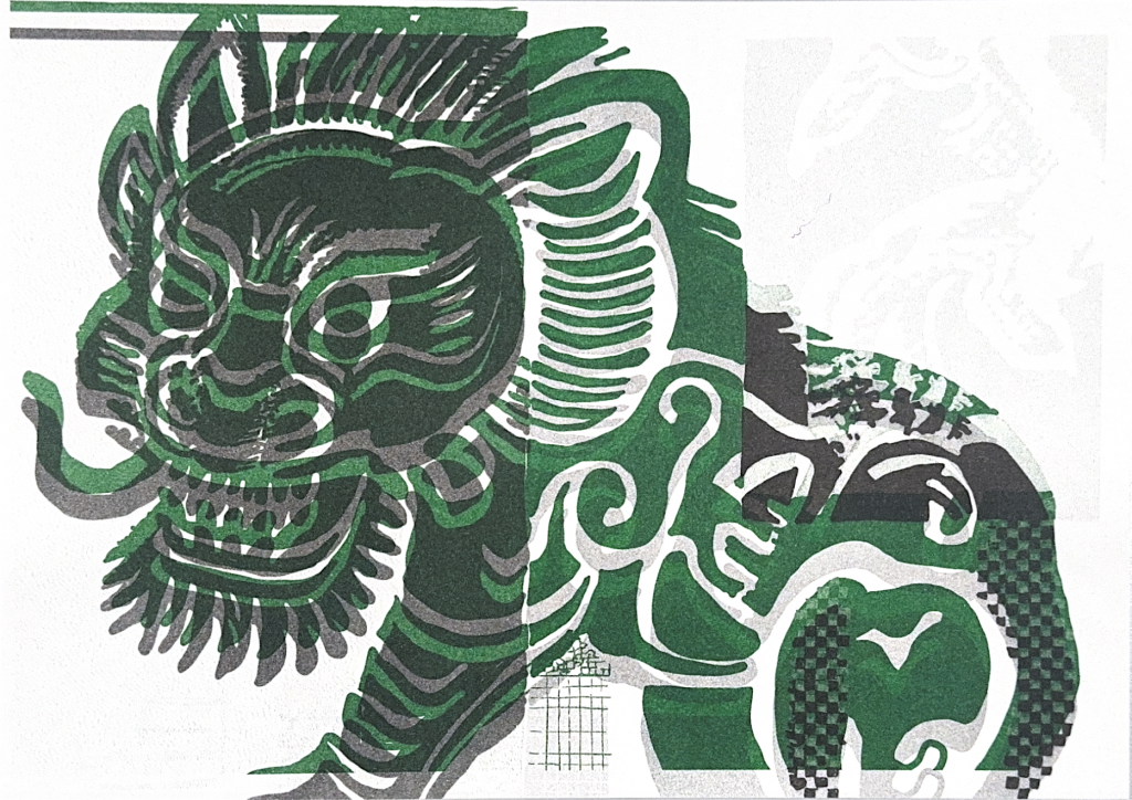
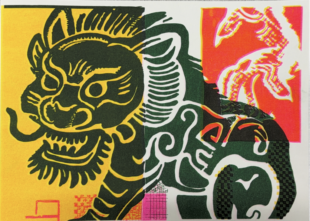
These prints were produced by printing yellow first, then red as the second layer.
Colour hierarchy: Yellow forms the base layer. When red overprints onto yellow, it shifts from pure red into warm orange-red. Where red is printed directly onto blank paper without yellow underneath, it retains a stronger, cleaner red tone.
Form transformation: Deliberate plate shifting creates misregistration and ghosting. The qilin outline is split and stretched by offset ink layers. Instead of a static reproduced image, layered ink produces a sense of movement.
Halftone and texture: Halftone dots from yellow and red overlap. In overlaid areas, ink builds up and creates denser texture. Uneven ink absorption by paper generates varied surface quality across the print.
The impact of printing sequence: Printing yellow first changes how red ink adheres to the paper. If I reverse this sequence (red printed first, yellow second), I will get completely different hues and textures. This outcome demonstrates that Risograph colour is not only determined by ink pigments, but also shaped by overprint order, paper absorption and physical interaction between ink layers.
Research relevance: This hacking experiment reveals how the Risograph process actively constructs colour and form. By breaking precise registration rules, unexpected visual results emerge. This aligns with Barbara Bolt’s concept of the excess of materiality, where materials and process produce outcomes beyond pre-planned design.
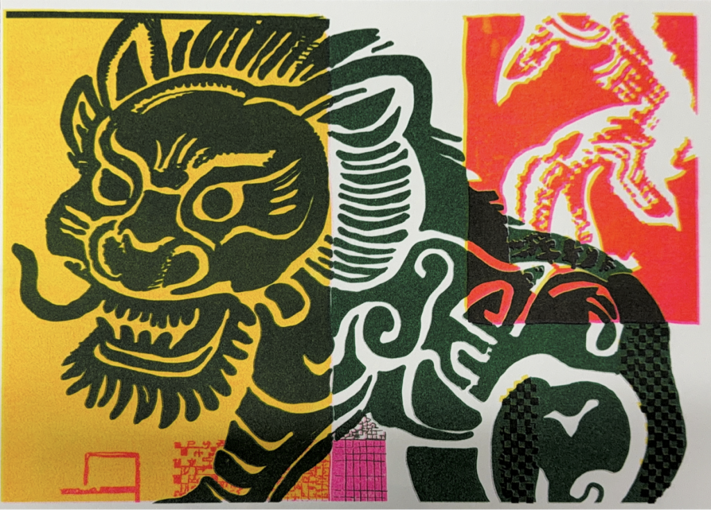
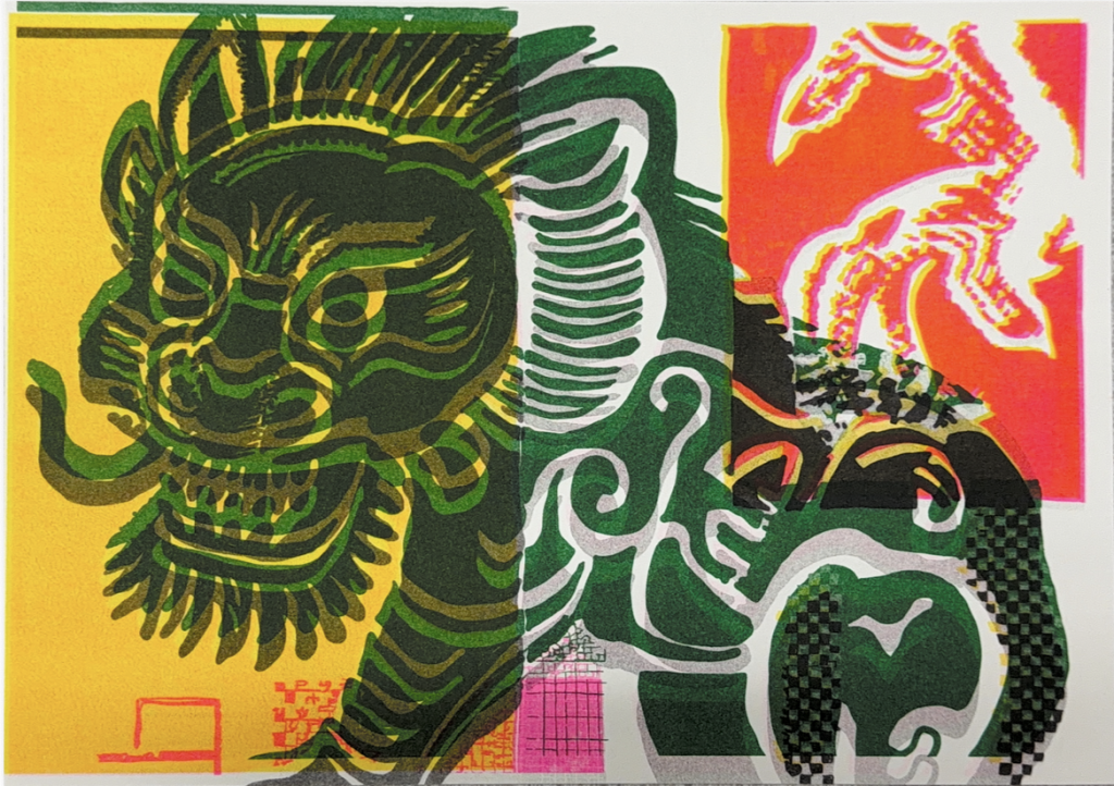
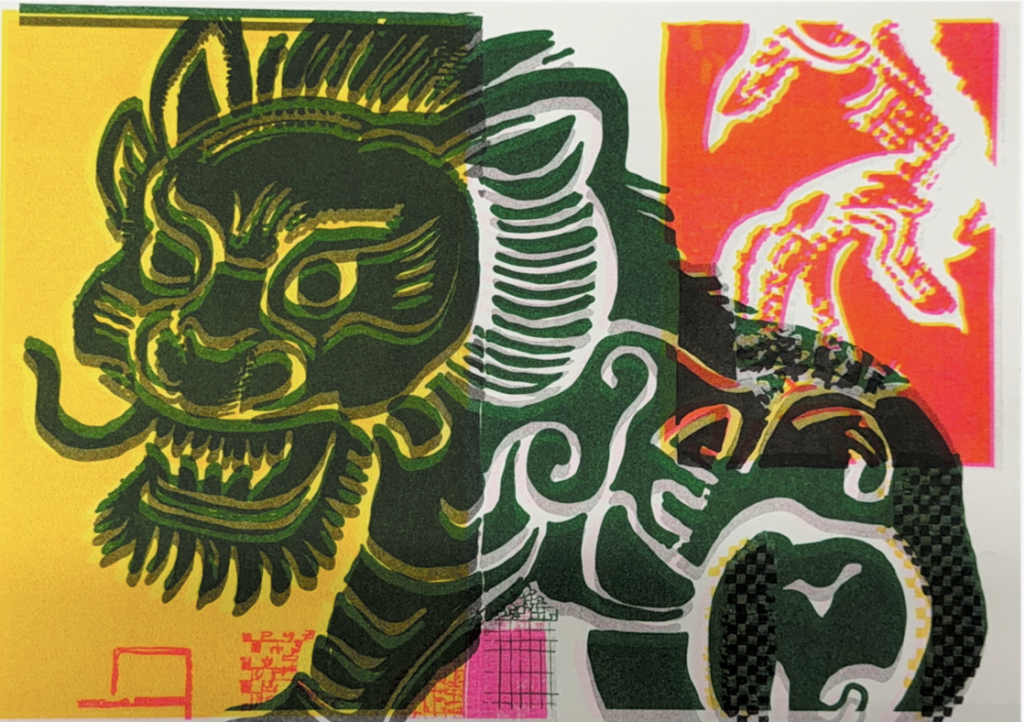
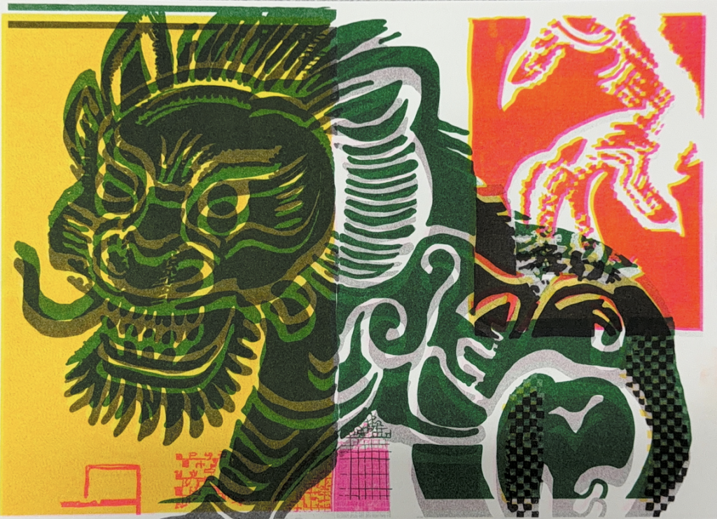
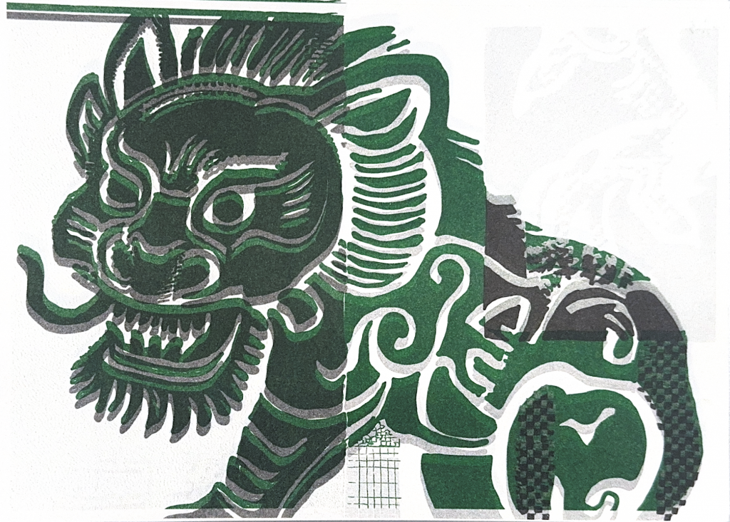
This set is printed with red first, then yellow, which reverses the previous printing order.
Hue difference:Because red ink is printed first into the paper, it affects how the later yellow ink adheres. Red areas overprinted by yellow often become darker, muted orange-red or brownish-orange. Yellow on blank paper remains bright, but it becomes darker when it overlays red. Compared with yellow-first prints, this red-first sequence produces a less vivid, more subdued colour result.
. Hierarchical change:The first colour acts as a base, while the second colour carries stronger covering power. In this case, yellow as the upper layer creates more obvious overlay, ghosting and positional distortion. The visual hierarchy is therefore different from the previous set.
Misregistration and form:Plate shifting causes the yellow layer to move across the red base, producing yellow ghosting, stretched outlines and separated colour layers. The qilin motif appears to be pulled apart by red and yellow layers.
Process conclusion:This result demonstrates that Risograph colour is not simply determined by the ink colours themselves. It is also shaped by printing sequence, paper absorption and the physical relationship between ink layers. Even with the same two colours, changing the order generates different material outcomes.
Feedback:
Max validated my tinkering experiments with halftone density and confirmed that this is a clear iterative practice.
For the next stage, I am encouraged to move from tinkering to hacking. I can break its conventional printing rules by adjusting plate positions and reordering ink printing sequences. Through repeated tests, I will observe unexpected visual shifts, new patterns and colour mixing outcomes, especially with limited ink colours such as two-colour overprinting.
Max recommends pausing frame-by-frame animation for this week. My main focus should be exploring the printing process and generating a large volume of physical printed samples. Reused waste paper can be introduced as an additional variable in hacking iterations: printing onto already printed sheets to create layered, accidental visual forms.
I should stay responsive to my experimental results, intuitively selecting compelling outcomes and continuing to iterate from interesting discoveries rather than chasing perfect prints.
Finally, Max advised me to read The Conditional Design Workbook from the online reading list to support my practice.
Leave a Reply